
Chance Encounters, Edition 2
Meet The Author

I require art. Art that lifts my spirits, art that provokes my emotions, art that fascinates my intellect.
I’m Laura Heyrman. Art has been at the center of my world for many years. I am an art historian and have studied and taught about art in its historical context and the relationships among art of different periods and cultures. One of the great joys of my life is spending time in museums and galleries immersed in works of art. I feel a deep admiration for the people who create art, for their commitment to their visions, for their ability to execute those visions, and above all, for the determination they demonstrate in a world that doesn’t always value what they do. I will be writing the majority of the content you encounter in I Require Art’s Substack, though we look forward to introducing other voices in the future.
For this post, I’m going to share some of my favorite works of art from across the Modern and Contemporary Periods. They are, as you will notice, quite diverse. If you were to ask for a list of features that characterize the works I like best, I’d be at a complete loss. I’m interested in nearly all art. Even art that I don’t particularly like can conceal compelling stories about the cultural context, the artist, or the making of the work. Here are 7 works that I love, along with some observations about what drew me to them.

Henri Matisse (French, 1869-1954) was one of the first 20th century artists whose work spoke to me. Matisse came late to art and found in it a refuge from life’s struggles. What I admire most about Matisse as an artist is his adherence to his idea of art as a source of pleasure and comfort. In the 20th century, when world wars and scientific advances led other artists to seek new ways of depicting the world and artists’ internal realities, Matisse continued to paint scenes of leisure, light-filled interiors, and beautiful women in bright colors and flowing lines. Interior at Nice comes from the period when the artist was living in a suburb of Nice on the French Riviera. I can imagine myself relaxing on that balcony, but I also love looking at Matisse’s layered patterns and repetitions of shapes and bright colors.
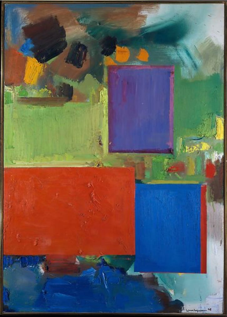
An artist who helped me appreciate non-representational or completely abstract art was German-born American artist Hans Hofmann (1880-1966). Hofmann’s work shares an important characteristic with Matisse’s, intense color, and that’s what encouraged me to take time to explore Hofmann’s art. Hofmann’s works, including this one, depend on contrasts of color, shape, and texture to create depth and movement. The movement comes from the brushy colors that fill the canvas and contrast with the sharply defined rectangles. The lime green section at the center left acts as a transition by retaining the painterly effect of the background while aligning with the rectangles adjacent to it. Meanwhile the purple, red, and blue rectangles create depth by overlapping the organic masses of color. The purple rectangle seems to be particularly three dimensional because of its lighter purple frame. I love the richness of the color and the thick, lumpy paint that tells a story of the work’s making.
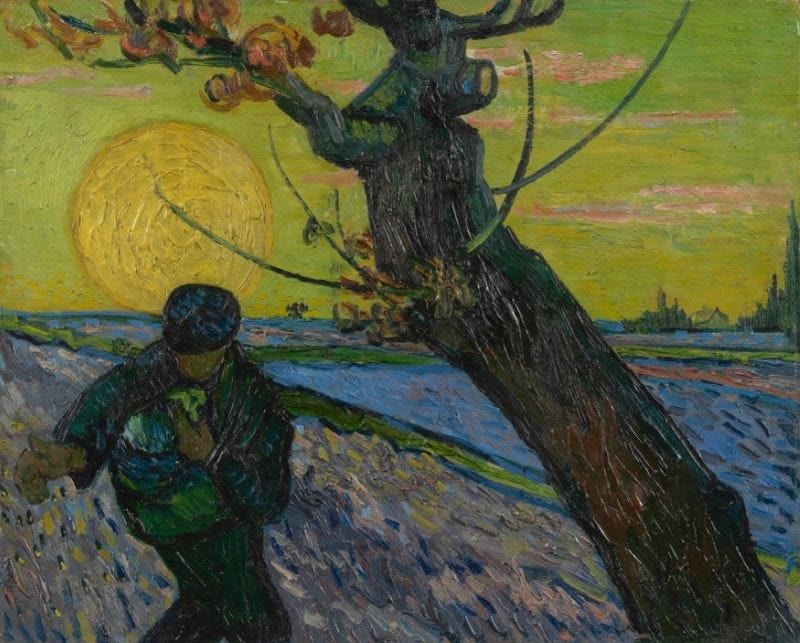
As they do in Hofmann’s works, the bold color and thickly textured paint in Vincent Van Gogh’s paintings attract me. Of all elements of art, color was most important to Van Gogh (Dutch, 1853-1890), who is reported to have said “Color in a picture is like enthusiasm in life.” The Sower is filled with strong colors, but it also shows the influence of Japanese woodblock prints, an art form of which I’m very fond. The Japanese influence is seen in Van Gogh’s having broken up the composition into relatively simplified shapes. The intensity of feeling he conveys and his beautiful landscapes appeal to me, as they do to many people, but I also love his sculptural use of paint and thoughtful compositions. This work, probably my favorite of his, demonstrates his characteristic deep feeling, rural subject matter, and mastery of color, texture, and composition.

Surrealism, an artistic movement that originated in the 1920s and 1930s, was dominated by male artists in its earlier years and that domination was reflected in what I was taught and the textbooks from which I taught for many years. Fortunately, the women of Surrealism have been brought into the light in recent decades. The Spanish-born Mexican artist Remedios Varo (1908-1963) quickly won me over with her approach to Surrealism. This major painting by Varo was recently acquired by the Museum of Fine Arts, Boston and is currently being exhibited there. Tailor for Ladies has all of the characteristics that have fascinated me in Varo’s works. The tailor, whose eyes and nose are a pair of scissors, is entertaining a client while three women model his designs. The models and client are typical Varo figures, with egg-shaped heads and quite tall with tiny hands and feet. The magical dresses, a pink boat-like creation that rolls in on a single wheel, a gray-blue dress with scarves that have produced a seat and cocktail tray, and a deep purple outfit from which fizzy bubbles stream, have bewitched the client. The painting is packed with tiny, strange details to confuse and, in my case at least, enchant the viewer. If you are fortunate enough to be in Boston, you should check out this wonderful painting.
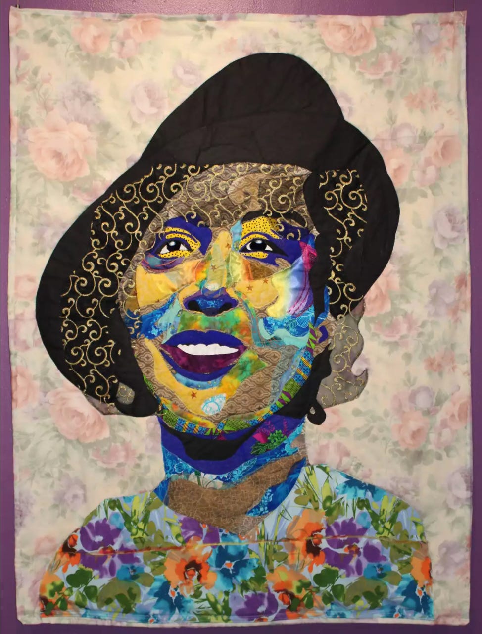
Though I set out to share the traditional media of painting and photography with you, I broke out of my own guideline and selected a work by an amazing contemporary artist who “paints” with fabric, Bisa Butler (American, b. 1973). In the summer of 2021 I had the opportunity to see the first museum exhibition devoted to Butler’s eye-popping quilts and I was flabbergasted. The artist’s quilts use fabric to interpret historical photographs of Black people. The quilts convey a three-dimensional image while re-envisioning and enlivening the subjects of her works through Butler’s fabric choices. In Wrapped in Rainbows, Butler created a portrait of the Black author Zora Neale Hurston. Two visual details drew me to this particular work. First is the contrast between the vivid colors of the face and shoulders and the washed-out floral background. To me, this encapsulates the title, which comes from something Hurston once said. Then I realized how Butler framed Hurston’s face with raised golden arabesques on a transparent dark mesh. This work is typical of Butler’s technique but each work is so individual, I never tire of looking at them.
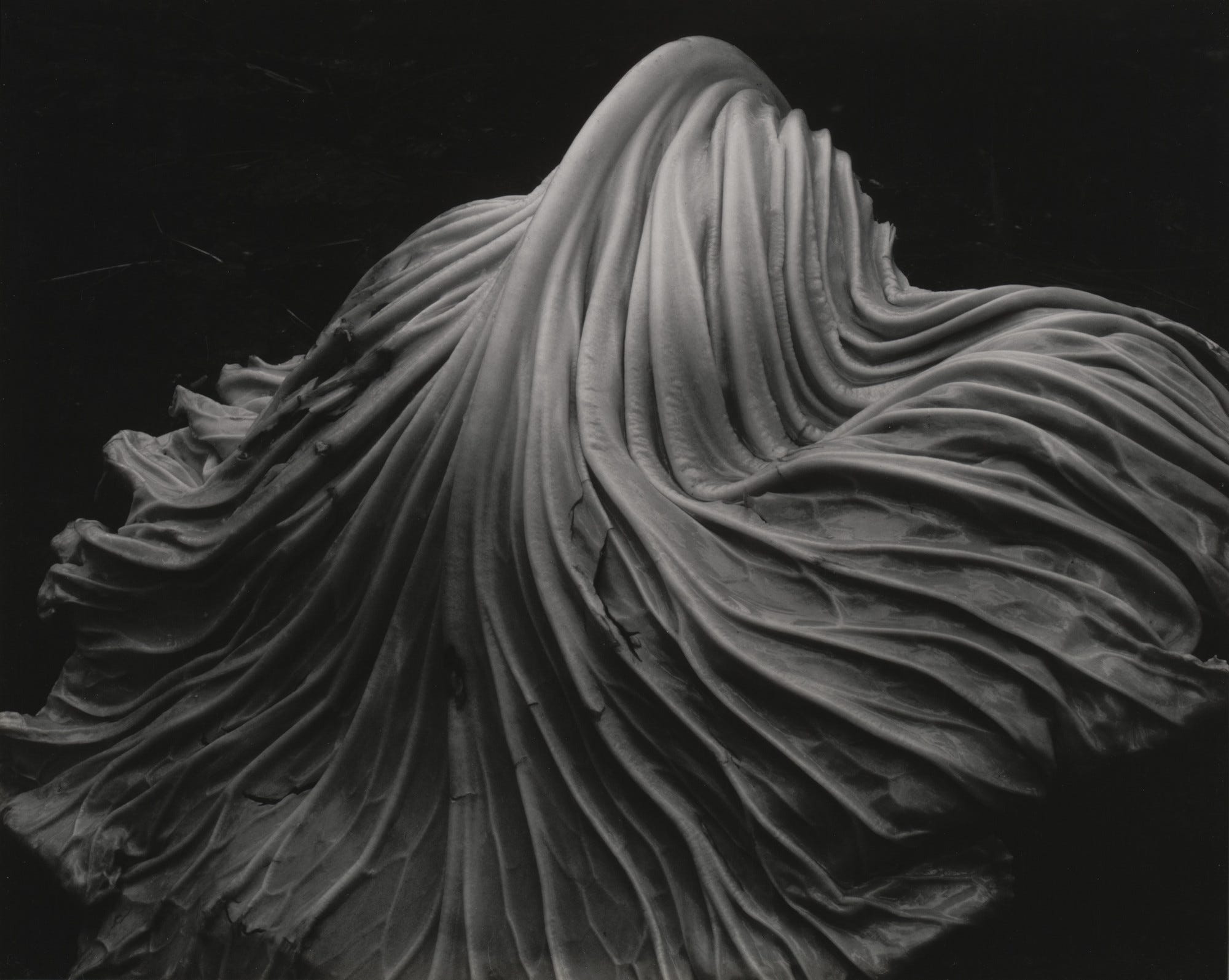
It is hardly possible to talk about art of the Modern period without considering photography. Appearing on the threshold of the Modern period, in the 1840s, early photography was strongly influenced by previous developments in painting and printmaking, but photography was soon providing inspiration to painters and other artists. Edward Weston (1886-1954) was an influential American photographer who abandoned the early 20th century Pictorialist movement, with its soft-focus, often romanticized content, in favor of realistic, detailed work, sometimes known as straight photography. Weston photographed a broad range of subjects but by far my favorites are the photos in which he shot close details of objects, converting them into strongly abstract images. The first photograph of this type by Weston that I encountered is shared here. Cabbage Leaf is simply what it says, but Weston’s camera angle and exquisite lighting emphasize the flowing texture of the leaf, leading the viewer to look more closely to confirm that this is a vegetable and not a swath of elegant fabric.
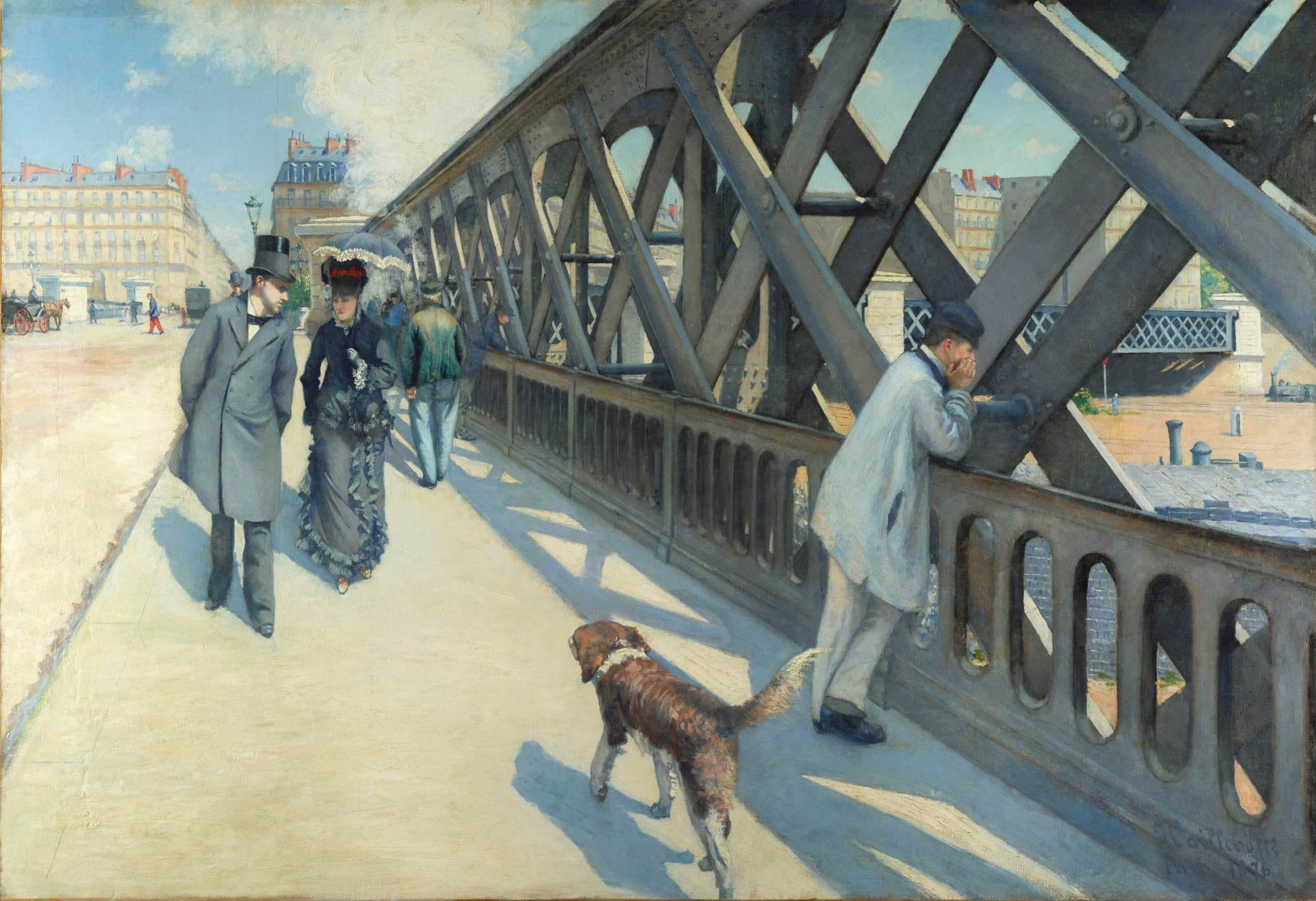
People often ask me who my favorite artist is, and though Remedios Varo and Bisa Butler are flying up my personal Hit Parade, for many years and still, my answer has been the French Impressionist Gustave Caillebotte (1848-1894). A lawyer and engineer, Caillebotte rejected those careers in the early 1870s in favor of painting. Caillebotte’s style is often noted as being more realistic than his colleagues’ but his subject matter is purely Impressionist – leisure activities of the upper middle class and the life of the contemporary city. I’ve loved Gustave Caillebotte’s works since I first encountered this painting as an undergrad. The Europe Bridge shows the engineering marvel of the bridge over a railway yard and contrasts the bridge with the traditional architecture seen in the left distance. As in many of his works, Caillebotte makes you feel as if you are about to step into the painting’s space, following the strutting dog (modeled on Caillebotte’s own pet) and strolling toward the approaching man-about-town. This you-are-there quality is something I love in his art, along with the carefully observed details of life and landscape.
I’ve returned to where I started, with Henri Matisse. One of the joys of the internet is discovering films and videos showing artists at work. In this clip, we see Matisse working at the art form he invented late in life - the cutout. Collages cut from previously painted sheets of paper, the cutouts came about as a solution to Matisse’s inability to stand to paint or work on sculpture as he had in the past. Confined to a wheelchair or his bed after cancer surgery in 1941, Matisse cut shapes freehand from gouache-covered paper which he arranged on paper supports or even had attached by his assistants to walls under the artist’s direction. To me, this phase of Matisse’s career, which he himself called “a second life,” demonstrates the necessity for art in life. For an artist, the need to keep creating, no matter what. For me, the need to keep experiencing the riches that artists have created.
Thank you for reading. Join me soon for the next edition of Chance Encounters.
Tailor for Ladies. Never saw anything by this painter! I love her!
Love!