


Chance Encounters, Edition 10 (re-post)
Rothko: The Power of Color

A painting lives by companionship, expanding and quickening in the eyes of the sensitive observer. It dies by the same token. It is therefore a risky and unfeeling act to send it out into the world. — Mark Rothko (Tiger’s Eye magazine, 1947)
No artist provokes more polarized commentary on I Require Art’s Facebook page than Rothko (American, 1903-1970). In this edition of Chance Encounters, I’m going to describe the development of the artist’s style, discuss his art historical importance, and try to suggest ways to look at and think about his art. I admit to being a fan of Mark Rothko’s mature style, the infamous large scale paintings made up of blocks of color, but my goal isn’t to make anyone like Rothko’s art. Instead I want to demonstrate that he accomplished something important and influential and that he is a major figure in the Modern period of art history. Mark Rothko’s work was undergirded by seriousness of purpose; I believe that deserves respect even if you can’t enjoy the works of art themselves.
Mark Rothko was born Marcus Rothkowitz in Dvinsk, Russia (now Daugavpils, Latvia). His family emigrated to the United States, settling in Portland, Oregon when he was 10 years old. After attending Yale University between 1921 and 1923, the young man moved to New York City without graduating, where he began meeting avant garde artists and attending the Art Students’ League. Of the artists Rothko studied with and met, Milton Avery’s (American, 1885-1965) approach to color and paint application were especially influential on the artist’s development.
Beginning in 1929 and continuing for the next 20 years, Rothko taught art to kindergarten through 8th grade students at Center Academy of the Brooklyn Jewish Center. Like many early 20th century artists, he was inspired by the authenticity and emotional intensity of children’s art. He published an article about the art education of children and began but never completed a book on the same subject. For Rothko, art was as universal a form of self-expression as speaking or singing and children should be encouraged to exercise their creativity without restriction.
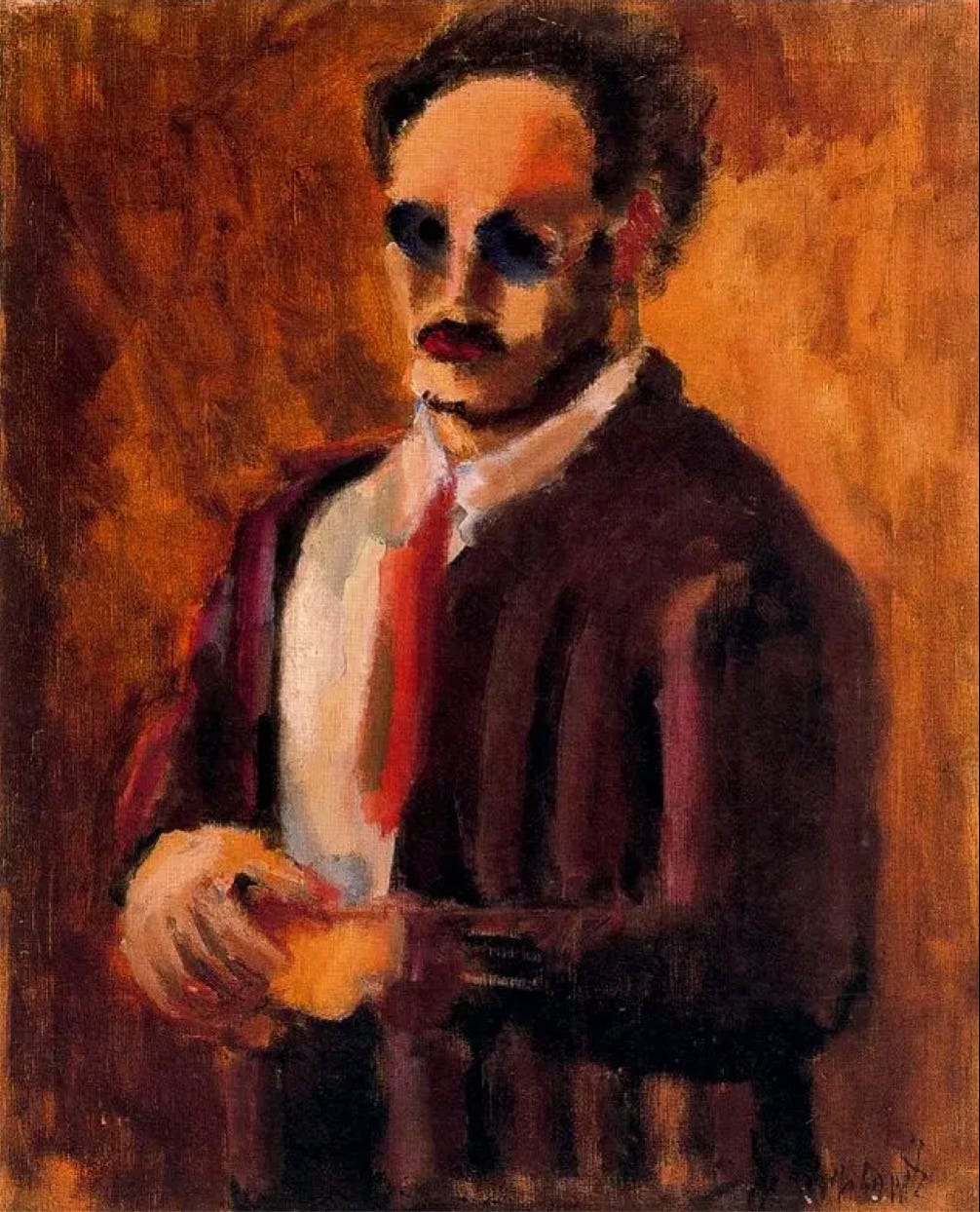
The artist’s 1936 self-portrait is painted in an expressionist style, characteristic of his early works. The work is painterly with some simplification and distortion of the figure’s appearance. Rothko’s sensitivity to color is apparent in the small spots of blue-violet representing the lenses of the figure’s glasses which stand out in contrast to the overall orange-brown palette of this painting.
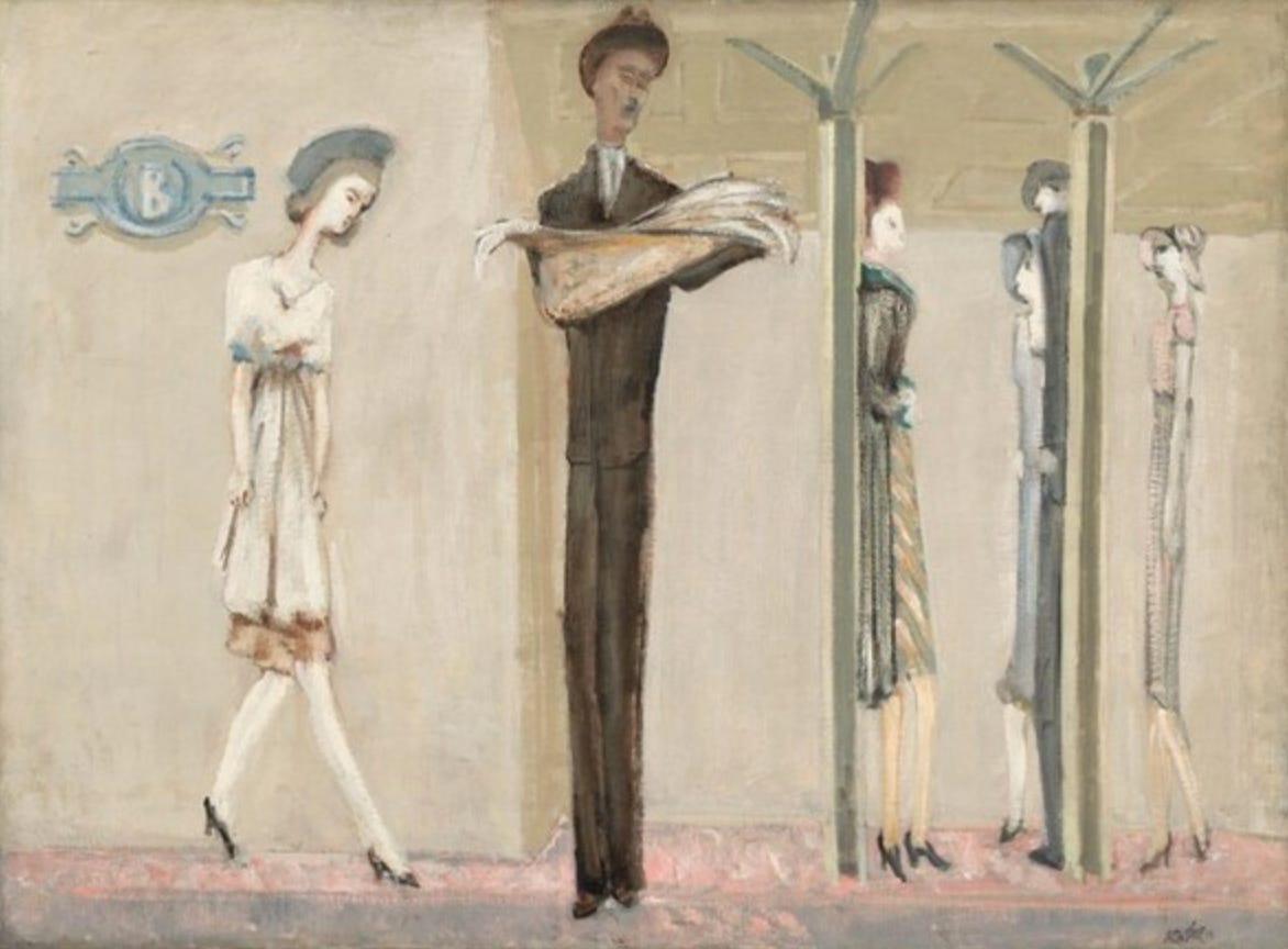
In the early 1940s, Rothko’s work continued in an expressionist vein with a preference for scenes of the streets and underground subway stations of New York City. Underground Fantasy is typical, with its elongated figures and architectural elements depicted in a restrained washed-out color palette. Some observers describe the works as expressing the alienation of urban life. What strikes me about this and other paintings in this period is how Rothko is already drawn to the horizontals and verticals of the scene; the figures are almost as architectural as the columns in this painting.
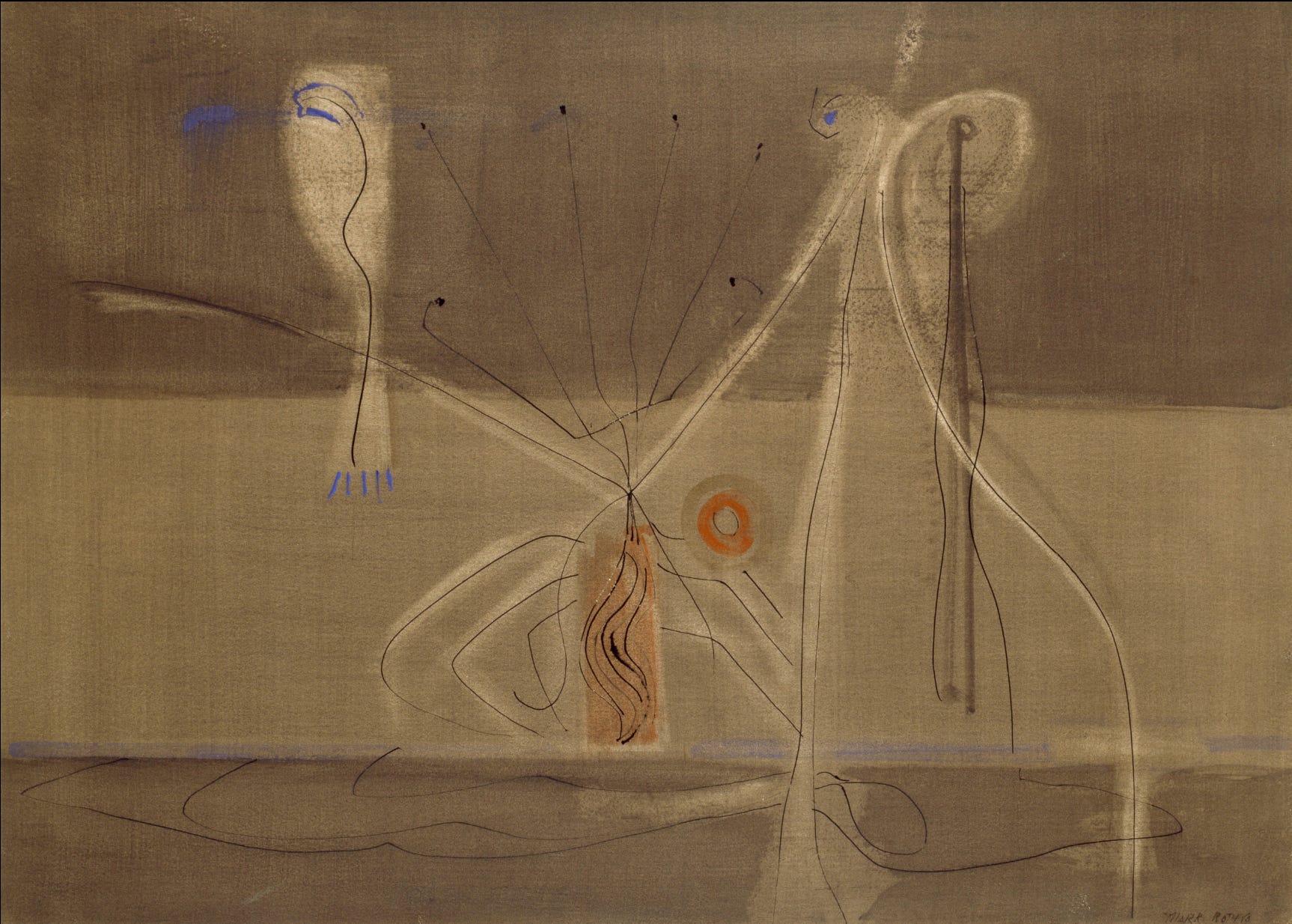
Mark Rothko and other young artists in New York felt that the scenes of everyday life they had been depicting were irrelevant to the anxieties of the 1940s. With the growing Nazi repression of avant garde artists, New York City saw an influx of refugee artists, many associated with the Surrealism movement. In combination with Rothko’s rejection of his earlier subjects, the influence of these experienced artists and their ideas led him to incorporate Surrealist biomorphic abstraction into his work in the mid to late 1940s. In Tentacles of Memory, the pale floating shapes and wiry lines are examples of biomorphic abstraction, forms that appear as if they could have grown or evolved in nature, though in fact they are the product of the artist’s imagination. At the same time, the banded structure of the background and the blurred edges look forward to Rothko’s mature style.
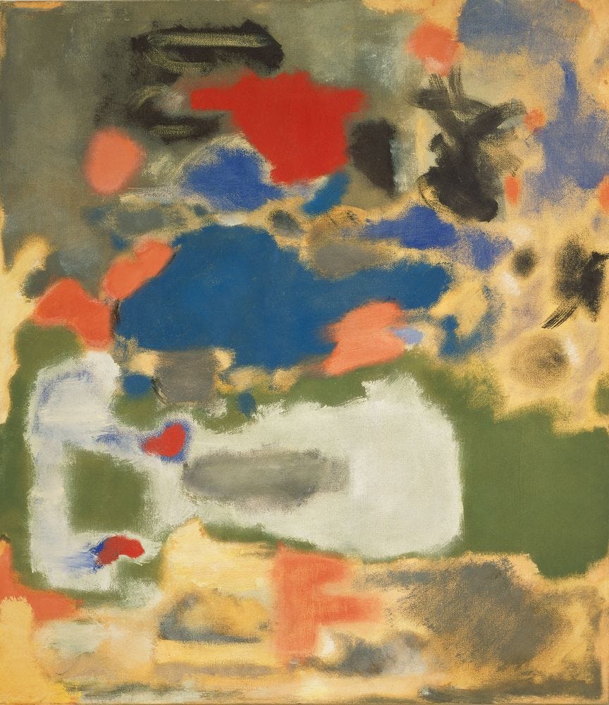
By 1947, Mark Rothko abandoned Surrealist visual form and titles in favor of shapes and patches of color such as are seen in Untitled, 1947. At the same time he stopped applying traditional titles to his works, leaving them untitled as in this case or numbering the works. The painterly, uneven edges of the shapes create an impression of changeability, as if the shapes ooze about or evolve from one color or shape into another. He saw the colored shapes as performers acting in an undefined space.
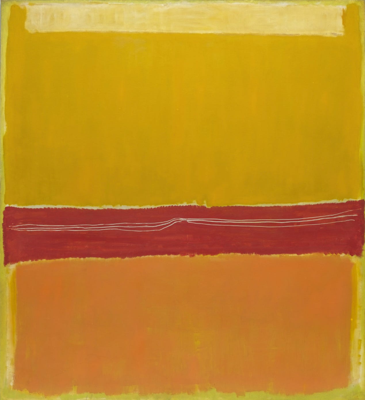
As time passed these colorful performers coalesced into rectangular masses of color floating over colored backgrounds. In No. 5/No. 22 from 1950, we can see how the edges of Rothko’s colored shapes waver and vary, helping to convey depth relationships. The whitish yellow shape near the top clearly overlaps the larger deep yellow rectangle which in turn overlaps the brighter yellow background color. At the same time, the deep yellow paint is clearly thinner in some parts letting us see how the paint was applied and increasing the wavering quality of shape and color. The scratchy white lines that wiggle across and meet at the center of the red band are an unusual feature of this painting. They and the hints of white at the edges of the red band suggest that the red was a later addition to the composition. Other hints of white appear at the edges of the orange shape at the bottom of the composition. One can look at Rothko’s paintings as one might study other works, especially other Abstract Expressionist works, for hints of the painting process. This isn’t necessarily how the artist wished viewers to experience his works but it is a path toward the careful looking that all art rewards. It is also a path toward being enveloped by the work as Rothko wished us to be.
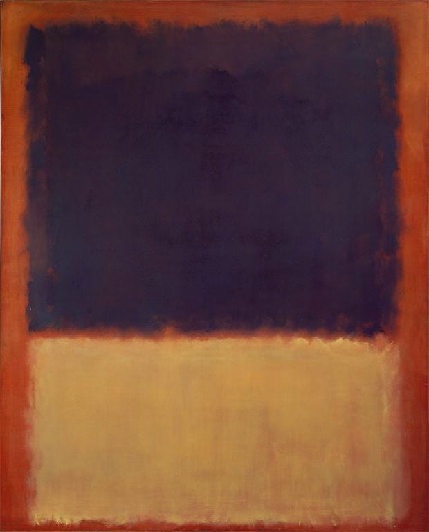
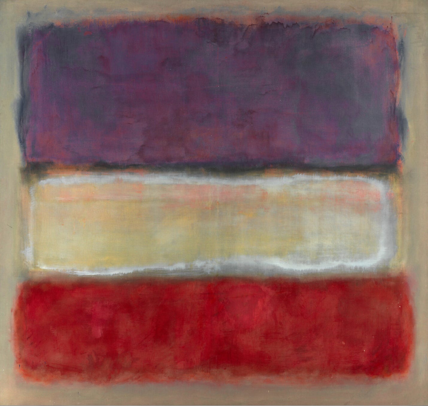
Of the works depicted in this edition, No. 5/No. 20 is the largest, but almost all of Mark Rothko’s paintings after 1950 were at least six feet tall or wide. Red Orange, Tan, and Purple (No. 203) itself is just over seven feet by five feet eight inches. Like his fellow Abstract Expressionists, Rothko believed in creating large works of art. In a 1958 lecture at the Pratt Institute, he asserted "small pictures since the Renaissance are like novels; large pictures are like dramas in which one participates in a direct way." Additionally, large paintings were viewed as significant works of art in European artistic theory from the 17th century on. Earlier Modern artists like Edouard Manet and Pablo Picasso had created large scale works as statements of their artistic goals. The Abstract Expressionists were following in their footsteps. For Rothko, there was another reason for choosing large canvases. He was attempting to create an environment for the viewer to be absorbed into. 1954 was the first time the artist requested that his paintings be displayed so that the first glance be close to the work so the experience would be of being within the color. This closeness to the work (Rothko recommended 18 inches as optimal) would also allow the viewer to experience the varied surface effects and the subtle edges of shapes the artist created. Works were also to be hung close to the floor so that they could be viewed the way he had painted them.
From 1949 on, Rothko’s intention was always that his works should create intimate environments that expressed intense and traditional themes of art like tragedy, ecstasy, and The Sublime. The theory of The Sublime was developed by the 18th century philosopher Edmund Burke who proposed that it so overpowered the human mind that the mind could recognize nothing but the object or event that had provoked the sensation. The Sublime was a concept that deeply influenced the Romantic art and literary movement, including the artist J. M. W. Turner (English, 1775-1851) whose work interested Mark Rothko early in his career. Rothko’s ideas about inspiring deep emotional connection in his audience has ties to 19th century Romanticism.
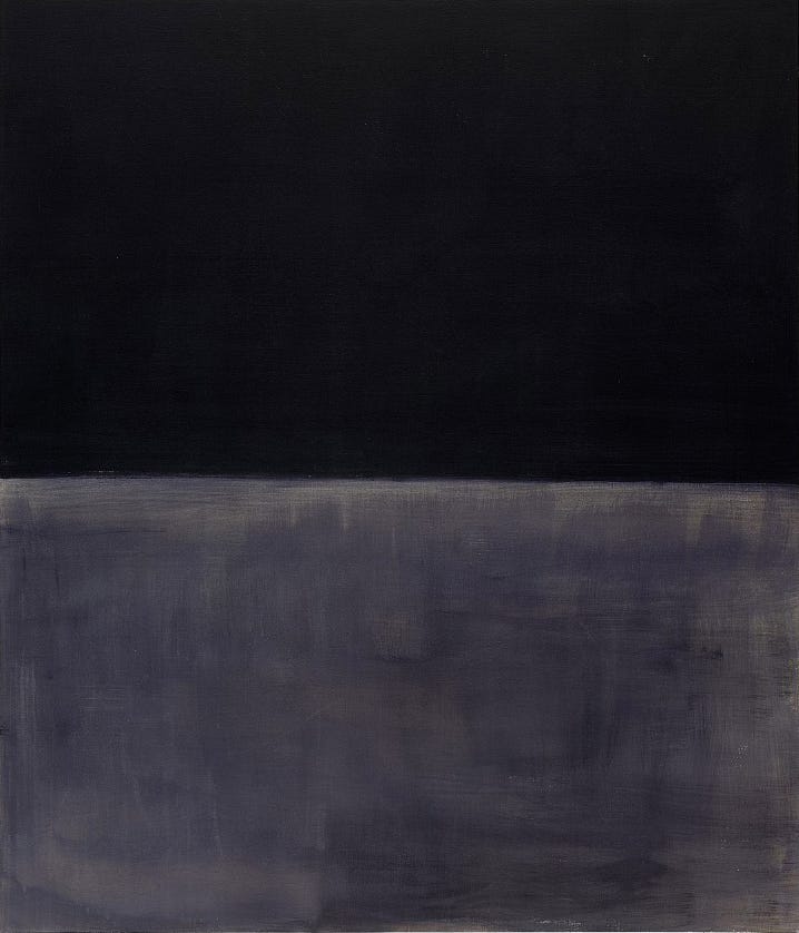
Late in the 1950s and continuing to his death in 1970, Rothko’s palette moved increasingly toward darker colors, dominated by deep reds, maroons, browns, and blacks. The last work reproduced here is from the last year of the artist’s life. His palette had shifted again, now being dominated by combinations of black and gray. As with the example here, these works contrasted smoother dark areas with a more painterly lighter gray section. This contrast gives the gray area a quality of brightness, like shimmering water at night. At this point in his life, the artist was suffering from a heart ailment that sometimes prevented him from working on the large scale canvases he preferred. At the same time his long-time battle with depression had intensified. Mark Rothko died by suicide on the 25th of February in 1970.
Rothko was one of the founding artists of the form of Abstract Expressionism known as Color Field painting. His works inspired other artists to experiment with the purely expressive possibilities of color, leading in varied directions from his example. Many of the works reproduced in Chance Encounters, Edition 8 about Lyrical Abstraction have roots in Mark Rothko’s ideas. More recently, in an Artsy.net editorial about Rothko’s influence on contemporary artists, American painter Byron Kim (b. 1961) said “Rothko’s paintings have come closest to demonstrating to me that color in the abstract can carry meaning. I mean color itself, not color with figuration, not color with composition, not color attached to memory, narrative, concept, or text.”
No work of art appears the same in reproduction as it does in person, even in the best quality digital image available today. This is especially true of large scale works like many of the paintings discussed here. It’s also true of works with subtle color and texture variations, also seen in Mark Rothko’s paintings. If you’ve viewed any of Rothko’s works in person, the reproductions here will remind you of those experiences. If you haven’t experienced any of his paintings in person, I hope my words and these images have piqued your curiosity and that you will seek out the experience of being up close and inside Rothko’s paintings as he intended them to be experienced. We welcome your comments and enjoy hearing about your ideas about and experiences with art. We’ll be back soon with more art and ideas for you.
I’m so glad you enjoyed this. Thanks for reading and for your appreciative comment.
Thanks for resharing! I’ve always enjoyed Rothko and this is the first time I’ve read a succinct summary of his journey to the color field abstracts we love so much.