


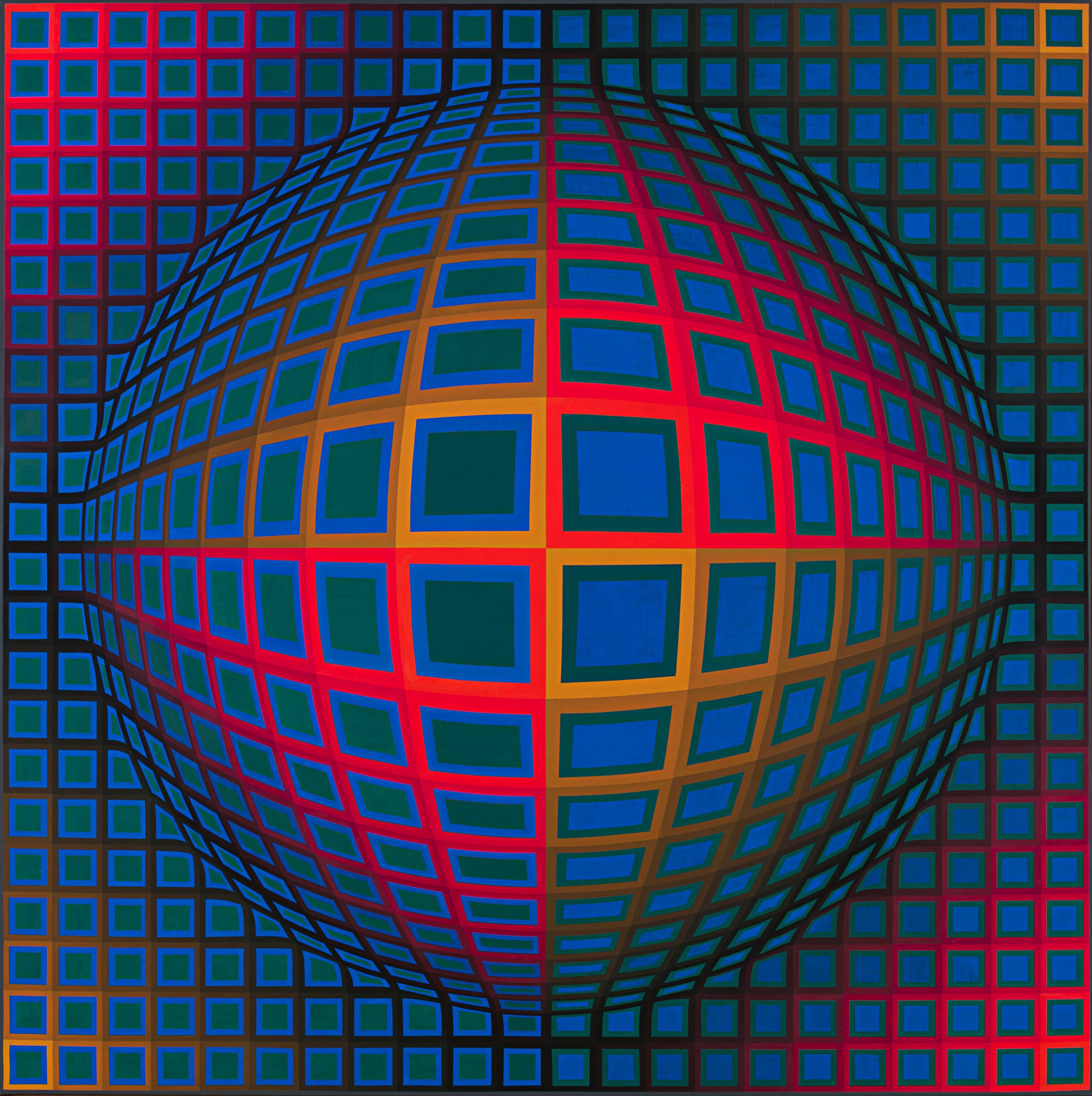
In this edition of Chance Encounters, I will explore the Op Art movement. Many viewers will be familiar with the boldly colored geometric designs created by Op artists like Victor Vasarely (Hungarian-French, 1906-1997), many of which incorporate optical illusions, as in Vasarely’s Vega-Nor where the canvas appears to bulge toward the viewer though it is in fact perfectly flat and very smoothly painted. The smooth surfaces and almost mechanical precision of Op Art were a rejection of the art and ideas of an earlier generation, the Abstract Expressionists, Art Informel, and Lyrical Abstraction (also known as tachisme), all of which stressed self-expressive works which advertised the processes and materials by which they were made. Op artists used well-established techniques of illusionism to trick the viewer’s eye and mind, often playfully and occasionally painfully. For most of these artists, the goal was to explore the nature of visual perception and to provoke the viewer to consider how their own perceptual system was functioning.
Vasarely left Hungary for Paris in 1930. He earned a living as a graphic artist and creative consultant for several advertising agencies while exploring ideas about geometric abstraction and optical illusion in his own works. The artist is often regarded as the grandfather of the Op movement and his painting Zebras (1937) has been described as the first Op artwork. Vasarely believed that humans need to be surrounded by an aesthetic environment just a they need sunlight, air, or vitamins. The artist wanted to develop a universal visual vocabulary of interchangeable compositional elements which could be used by anyone, just as he applied it to paintings, sculpture, and architecture.
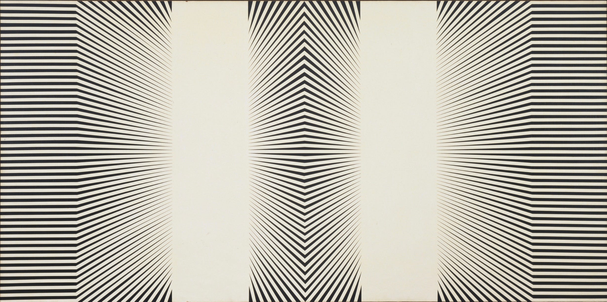
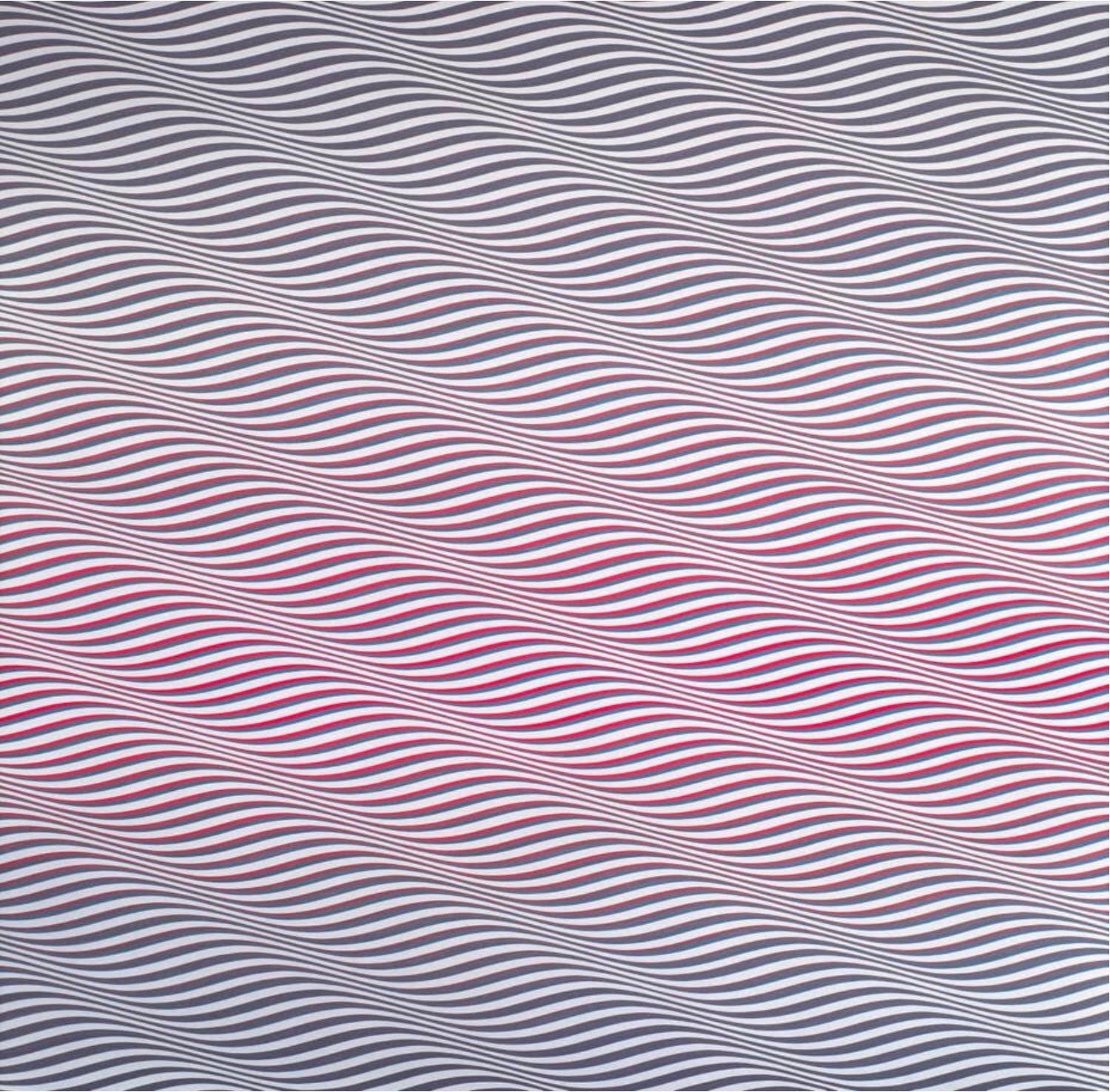
Op Art was an international movement, though it had its origins in Paris. Many of the early Op artists focused on black and white imagery as these were seen as visually balanced. The strong contrast allowed the artists to create the illusion of light and shadow in often mesmerizing works. Like Vasarely, American painter Arnold Alfred Schmidt (1930-1993) worked in advertising for many years. He had his first exhibition in New York City in 1964 and the large untitled painting above was included in the Museum of Modern Art’s landmark 1965 exhibition The Responsive Eye. This exhibition traveled to St. Louis, Seattle, Pasadena, and Baltimore, giving Americans their first look at Op Art (as well as other styles of the mid 1960s). Schmidt’s painting uses the black and white contrast and a patterns of slanting black lines to create an illusion of depth, as though two corridors lead to brightly glowing distant spaces. The Responsive Eye exhibition was very popular with museum visitors but American art critics were less excited by the art, several decrying it as anti-humanistic, “empty and spiritless” painting by numbers. A 1964 Time Magazine article was titled “Op Art: Pictures that Attack the Eye.” The underlying message of these critiques was that Op Art bypassed conscious thought by appealing directly to the viewer’s perceptual system, resulting an automatic, almost uncontrollable, response. I would argue though, that viewers usually respond instinctively to works of art, at least on first encounter, and that the conscious thought so valued by the 1960s critics is a secondary response.
Video showing the installation of several of Julio Le Parc’s Esferas (Spheres), published c. 2020 by Durban Segnini Gallery, Miami, Florida, USA.
In contrast, the European art world was more accepting of the new style, with Julio Le Parc (Argentine, b. 1928) and Nicolas Schöffer (Hungarian-French, 1912-1992) winning the Golden Lion awards at the Venice Biennales of 1966 and 1968 respectively. Le Parc’s early work was painting and printmaking, but in the late 1950s he began to explore the interaction of light and modern plastics like Plexiglas. In 1958 he traveled to Paris where he met other South American artists exploring Op art ideas, as well as Vasarely and his fellow Op artists. In the late 60s and 70s, Le Parc was engrossed in the political protests of the era, both in Europe and South America, and exhibited little new work. However, with the growth of interest in light art in the 21st century, his works are being exhibited more frequently, as in the video above.
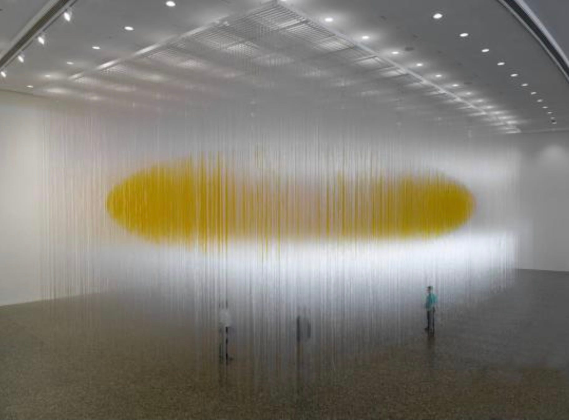
Le Parc and fellow South American Jesús Rafael Soto (Venezuelan, 1923-2005) created art at the intersection of Op Art and Kinetic Art. In fact, the two styles developed alongside one another and are frequently exhibited together. Both movements were concerned with motion and perception, literal motion in Kinetic Art and the illusion of it in Op. Another shared concern was the way that color and light could destabilize our sense of reality. Houston Penetrable, conceived by Soto near the end of his life and executed posthumously, is typical of the artist’s Penetrables. It creates an interactive environment of light, color, and texture through which viewers can move freely. The use of industrial materials, like the PVC tubes which comprise the majority of this work, is another characteristic shared by Kinetic Art and Op Art.
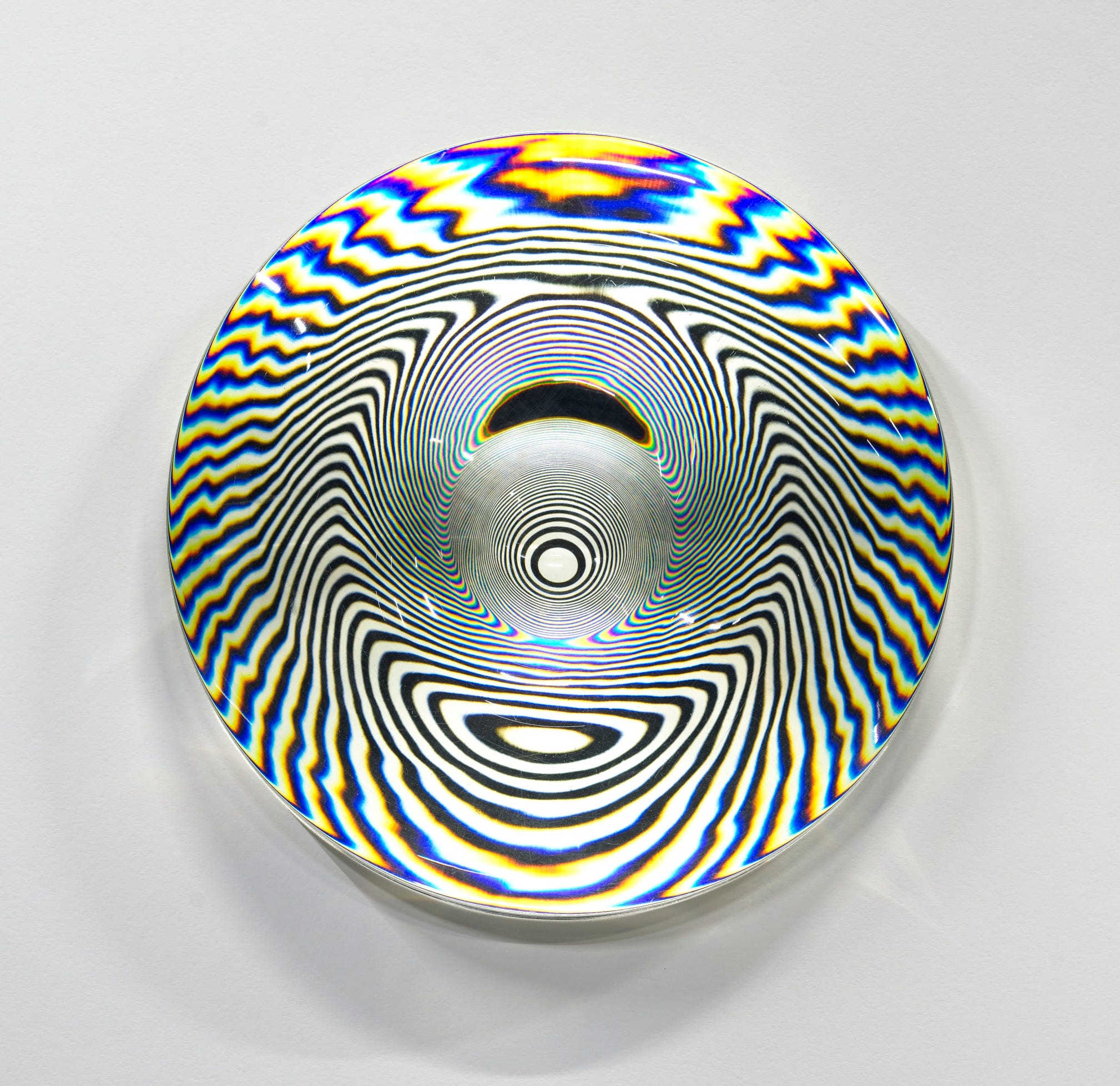
Lens Picture No. 15 by Karl Gerstner (Swiss, 1930-2017) is an example of an Op Art work using modern, industrial materials. The artist’s Plexiglas lens captures colors and patterns from the space where it is displayed, as well as causing them to interact with the light bulb and Formica behind the lens. As the viewer moves and observes the work from different angles, the patterns visible in the lens will shift. In this way, the viewer actively influences their own experience of the work, a goal of many Op and Kinetic artists. Like Vasarely and Schmidt, Gerstner started out as a graphic designer in advertising. He was a typographer too and regarded all aspects of his career as existing in the same realm of creativity. For Gerstner, using systematic programs of thinking resulted in a satisfying unity within any form of visual expression. The artist’s Lens Pictures mimic the effects of distorted television pictures, a theme which was interesting a number of artists during the 60s and 70s, eventually evolving into the field of media art. The Lens Pictures featured in the notable Responsive Eye exhibition as well as in other Op exhibitions of this period. Unsurprisingly, Gerstner began experimenting early on with computers as a tool of art-making. The computer allowed him to establish the parameters of his system or program and then apply it.
One of the best-known Op artists is Bridget Riley (British, b. 1931). Like many Op artists, she began her career by creating black and white paintings which provoked optical illusions such as afterimages, illusionary movement, and even the appearance of colors where none were present. After about 6 years, Riley began to incorporate color into her paintings.
Color presented a crisis for me. If you think of a square, a circle, or a triangle, no matter what size it may be, you know exactly what form you can expect to see. [Then] I saw that the basis of color was its instability. – Bridget Riley
Riley’s realization about the nature of color came after she spent two years studying and copying Georges Seurat’s Bridge at Courbevoie (c. 1886-1887). Seurat’s Neoimpressionist approach, which represented nature’s colors through small strokes of saturated color, allowed Riley to understand how the viewer’s perceptual system fills in the blanks of what it sees. In Seurat’s case, the result is seeing naturalistic areas of blended color when the viewer stands at the optimal distance from the work. Like other Op artists, using patterns of line, shape, and color, Riley manipulates our brains’ natural tendency to “make sense” of what we see. As a result, in Cataract 3, the colors (shades of red and blue) appear to seep into the white spaces in some places or seem to fade into gray in others. The curved lines, which alternate thinner and thicker sections, create the appearance of movement across the canvas. These illusions can, if we are willing to take the time, provoke us to think about what we are perceiving and why. That is, we become conscious of seeing as a physical action rather than as an unconscious sensory event.
An important advocate for Op art in the United States was Julian Stanczak (Polish-American, 1928-2017). Stanczak’s works use layered patterns of colored lines to explore geometry and color interaction. During World War Two, the artist endured a Siberian labor camp where he lost the use of his right arm. He retrained himself to use his left arm and emigrated to the United States in 1950. Stanczak studied at Yale University with Josef Albers, considered one of the most influential artist teachers of the 20th century. As an artist, Albers is best known for his Homage to the Square series in which he systematically explored color relationships, so it is not surprising that his students, including Stanczak and Richard Anuszkiewicz (below), were also deeply interested in color. The term “Op Art” was coined by the Minimalist artist Donald Judd (American, 1928-1994) in a review of Stanczak’s 1964 New York City exhibition but Stanczak preferred to call his art “perceptual art” rather than optical art.
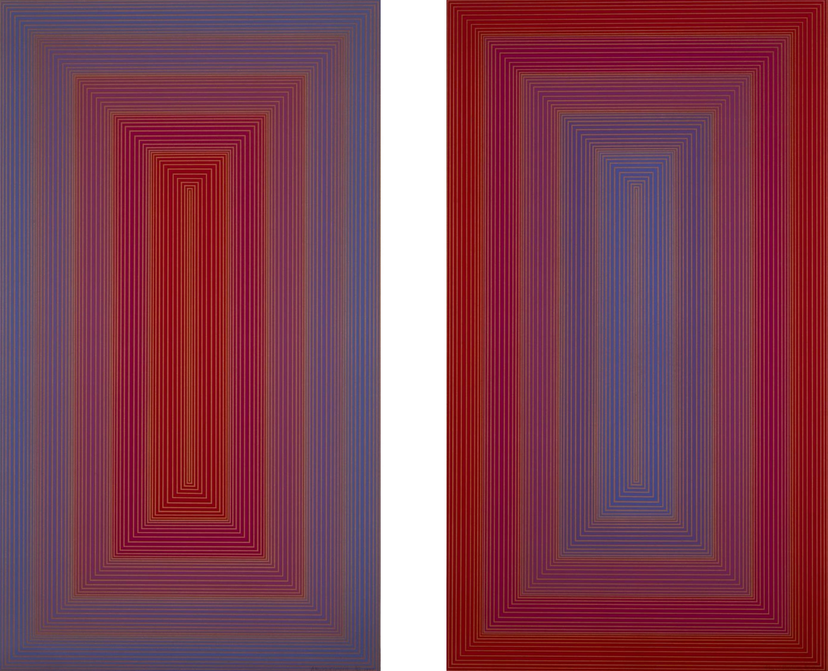
As mentioned above, Richard Anuszkiewicz was a student of Josef Albers at Yale, alongside Julian Stanczak. In fact, the two younger artists had both studied at the Cleveland Institute of Art in Ohio before attending Yale where they were roommates. Like Stanczak, Anuszkiewicz explored color effects in the context of geometry. In the examples above, the artist has used a tall rectangle to contain thin bands of saturated shades of red and blue. In the work on the left, blue is dominant in the outer sections with red in the center while the print on the right reverses the colors. The thin color bands viewed in these almost 9-foot tall works appear to vibrate and move toward and away from the viewer. The colors themselves seem to change depending on the lighting and to what shades they are adjacent.
The drama — and that feels like the right word — is in the subtle chemistry of complementary colors, which makes the geometry glow as if light were leaking out from behind it. – Holland Cotter, in a New York Times review of an exhibition of Richard Anuszkiewicz’s work, December 15, 2020
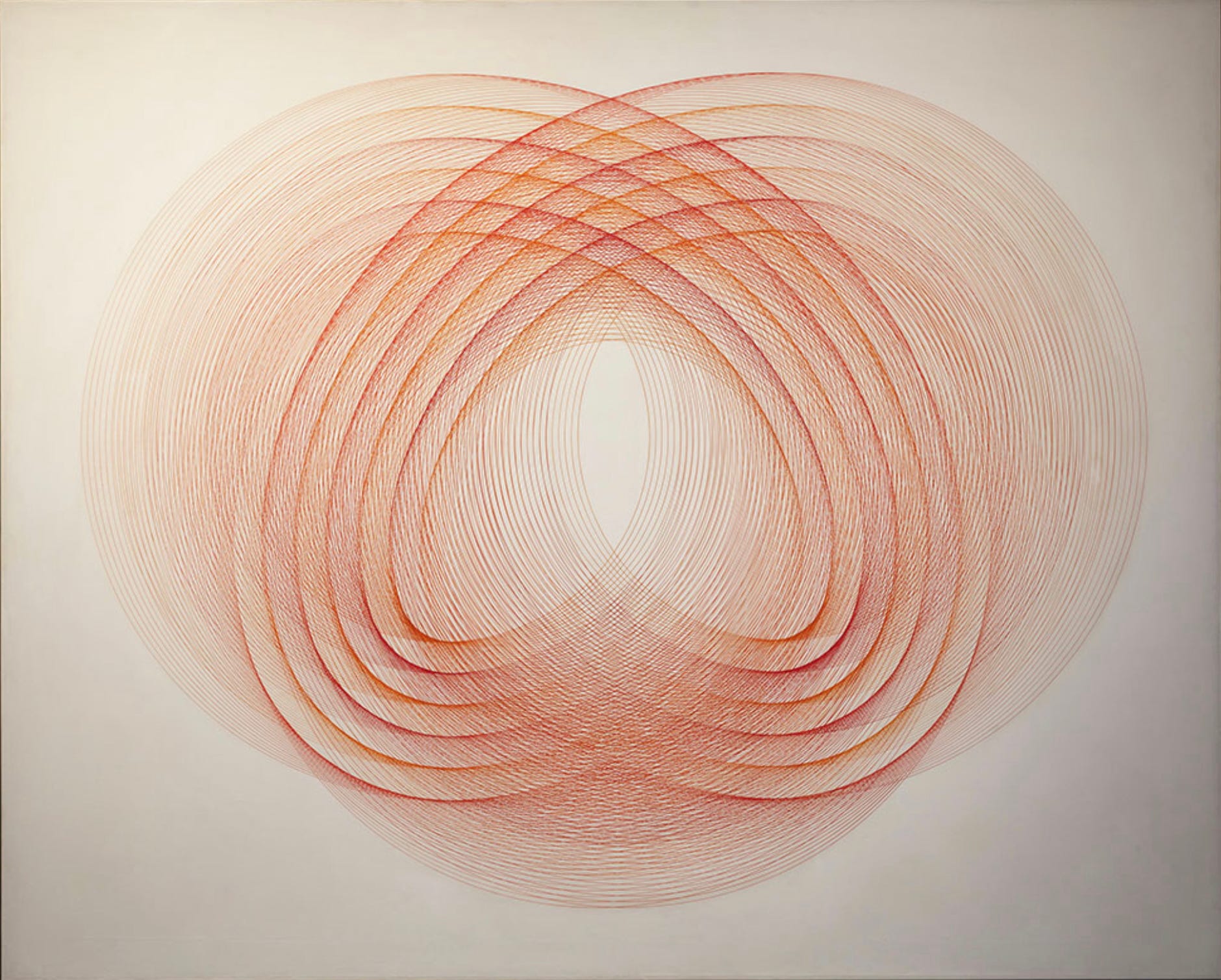
Argentine artist Eduardo Mac Entyre (1929-2014) shares characteristics with several of the artists discussed above. He was one of the large number of South American artists who gravitated toward Op Art styles and he worked in advertising as had Vasarely and Gerstner. Also like Gerstner, he adopted the use of computers early in his career and may have worked out his complex linear designs using a computer before transferring them by hand to his prints and paintings. Mac Entyre was the cofounder of the Argentine group called arte generativo (Generative Art), which sought to develop a visual language of lines and geometric shapes suggesting vibration and movement due to repetition. In this we see a similarity to the work of Stanczak and Anuszkiewicz, but as can be seen in the example above, Mac Entyre’s works consisted almost entirely of lines.
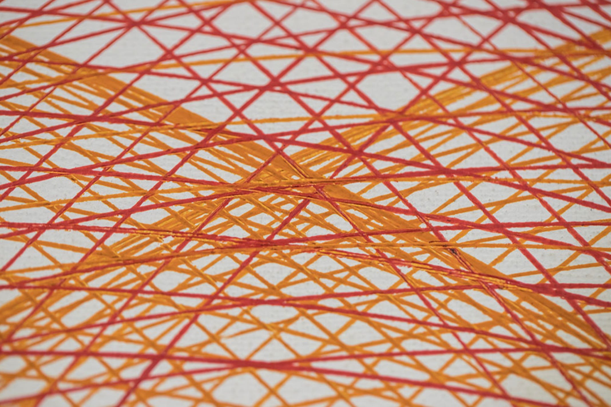
This detail view of Six forms in Two Dimensions shows the extraordinary precision with which the artist applied the red and orange paint in this work. The areas of denser color seen in the full view occur because of overlapping and intersecting lines, creating the light effects and movement so beloved by the Op artists.
In the 1960s and 1970s, Op Art came to symbolize technology and especially computers in the public imagination. One reason for this was the adoption of Op-style graphic design on the covers of magazines and manuals dealing with science, technology, and computer programming. By the 1980s, Op began to influence popular culture in the form of movies like Tron (1980), arcade games (Maze Craze, 1980) and video games (Space Lace for Apple II in 1987.
Today, many artists use computers as tools; digital and media art have exploded in popularity among artists and their audiences. The original Op artists created their works with purely analog materials and techniques or with the most rudimentary and limiting computer resources. These artists were inspired in part by the new technology but also by scientific developments concerning perception and neuroscience. Op Art plays with both active and automatic perceptual responses while exploring visual illusions. The artists sought to challenge us to consider the nature of visual perception, as well as to surprise and delight us.
Op Art and its influences over the past 60 years is the subject of the exhibition Electric Op at the Buffalo AKG Art Museum, Buffalo, New York, USA through Monday, January 27, 2025. https://buffaloakg.org/art/exhibitions/electric-op
Thanks for reading and subscribing. I’ll be back next week with more art.
The Vasarely painting is Wonderful. I love it
I love this edition of Chance Encounters on Op Art!