In the early 20th century, Paris was filled with artistic energy and innovation. Fauvism and Cubism were attracting considerable attention, while Expressionism, Futurism, and a host of other -isms were being proposed as new and better ways to create art. In this environment, spouses Sonia and Robert Delaunay, along with František Kupka, combined ideas from several other artistic movements to develop a new style eventually named Orphism, currently the subject of an exhibition at the Guggenheim Museum in New York City. These artists saw color as the expressive and structural basis of painting and their goal was to create art in which color functioned in the same way that the melody and harmony structured musical composition.
Orphism could be representational, though abstract, or non-representational, pure abstraction, as can be seen in the two paintings by Sonia Delaunay (Ukrainian-French, 1885-1979) included in this edition. Electric Prisms was inspired by the experience of seeing electric street lights in Paris, a modern invention first used in that city and still a relatively rare sight when this work was created. Despite her inspiration in a real world experience, this painting contains no recognizable objects, depending entirely on geometric shapes and color for its impact. From two main orbs, bands of color expand like ripples in a pond, each set divided into quadrants so that different color relations are demonstrated within a single circular group. The bands include sections with fragments of the rainbow spectrum, with complementary pairs (red/green, yellow/purple, orange/blue), and with analogous color groupings (sets of adjacent colors such as red/orange/yellow or green/blue/indigo). In this Delaunay was following the color theories of Michel Eugène Chevreul, a French scientist whose ideas had previously inspired painters Georges Seurat and Paul Signac. Of particular importance to both the Neo-Impressionists and the Orphists was the concept of “simultaneous contrast,” which explains that the placement of one hue among other colors will affect the viewer’s perception of that hue. For example, complementary colors will appear more vivid when adjacent. Though later named Orphism, the Delaunays referred to their style as simultanism (simultanéisme) after Chevreul’s theory.

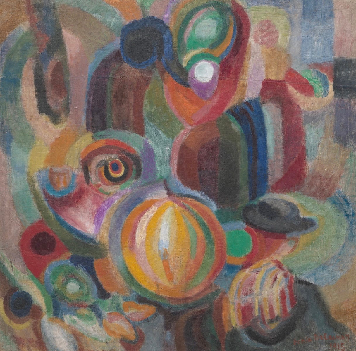
Painted a year after Electric Prisms, Portuguese Market uses many of the same radiating bands and color combinations, but this time to depict recognizable objects, such as the large melon and various figures, one in a hat at lower right and a woman or group of women in the upper right. When the works of the Orphists were first presented to the public in the 1910s, they were seen as variants of the recently introduced Cubism of Pablo Picasso and Georges Braque. Those early Analytical Cubist works were monochromatic, so the bright colors of these artists were correctly recognized as an attempt to marry Fauvism and Cubism.
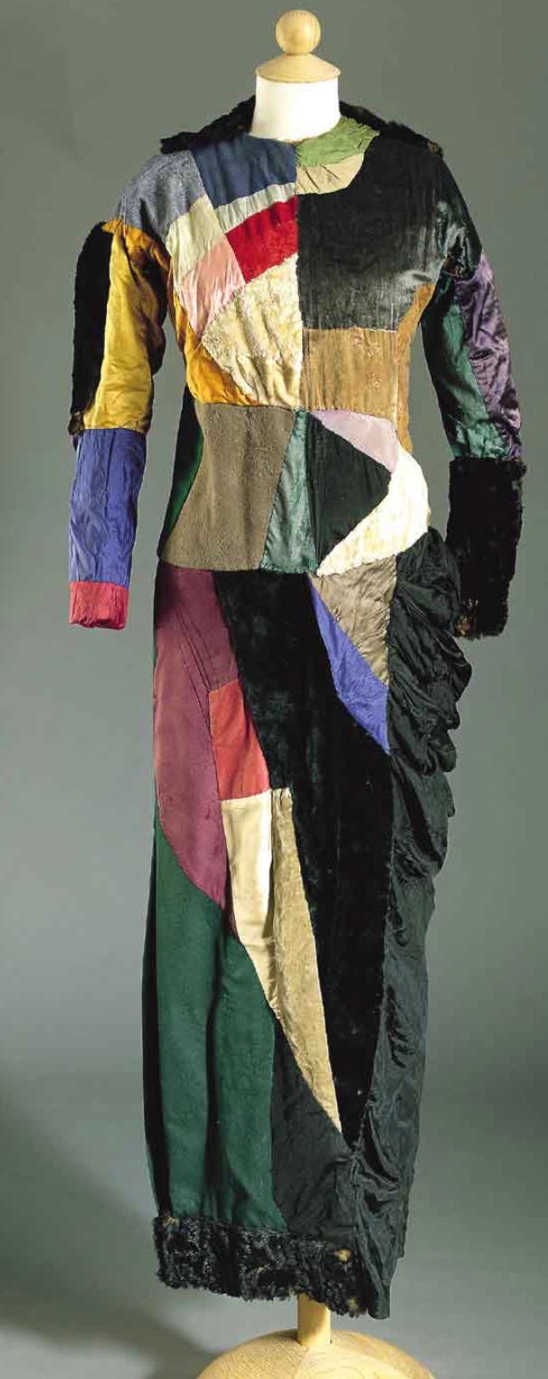
Portuguese Market was created when the Delaunays were living in Portugal during World War One. They had been visiting Spain when the war began and relocated to Portugal where they had friends. It was during this period that Sonia Delaunay began to work in fashion and fabric design on a professional basis. Earlier in her life, using the same color theories she and her husband employed in their paintings, the artist had experimented with using brightly colored fabrics in decorating their home. In 1911, she created a blanket for their baby, based on memories of similar blankets she had seen as a child in Ukraine. Later in life, the artist said that the result seemed similar to Cubist paintings and inspired the Delaunays to apply the idea of color patches and fragmented forms to their paintings. Her next step was to apply these ideas to dresses which she created for herself and her friends; a rare surviving example is shown above. In need of funds during the war years, the artist turned this hobby into a business. Her designs were much in demand, her clothing by wealthy women and her textiles for movie sets. Sonia Delaunay maintained a series of fashion and design businesses in the years between WW1 and the Great Depression; thereafter she continued to design fashions and fabrics, but no longer felt constrained to follow the taste of her customers. Instead she followed her own imagination and inspiration, creating vibrant designs for the remainder of her long life.

Allied with the Delaunays in developing Orphism, František Kupka (Czech, 1871-1957) settled in Paris in 1894, and was more than a decade older than his Orphist colleagues. Kupka had trained in Prague, Russia, and Germany, learning a traditional style and depicting themes from history and myth. Strongly influenced by Theosophy (see CE 24: Kandinsky) and spiritualism, the artist was in search of an approach which would allow him to express his beliefs. Disks of Newton is one of a series of studies Kupka created as he developed his larger composition Amorpha (Fugue in Two Colors). The title of this study refers to Isaac Newton’s discovery of the spectrum created by sunlight passing through a prism. In the painting, Kupka includes all of the relevant hues but they radiate in arcs from circular forms, similar to the radiating effect favored by Sonia Delaunay. For Kupka, however, these radiating forms were tied specifically to his Theosophist and spiritualist beliefs in the auras produced by human forms and the visions he experienced in clairvoyant trances.
An Orphic painter's works should convey an 'untroubled aesthetic pleasure', a meaningful structure and sublime significance. – Guillaume Apollinaire
Poet Guillaume Apollinaire (French, 1880-1918) was closely associated with nearly every avant garde literary, musical, and artistic movement of early 20th century Paris. In the visual arts, he was close to leading Cubists, Fauvists, and members of Dada, as well as the Delaunays and Kupka. It was Apollinaire who coined the name Orphism in connection with paintings by Kupka, which the poet described as approaching “pure painting.” The name refers to Orpheus whose music could tame beasts. The mythical Greek figure had become a symbol of the Artist in both literature and visual arts during the late 19th century Symbolism movement, because his music survived the limitations of his mortal life. Apollinaire praised the way that Kupka and his colleagues created colors from their imaginations, without reference to the real world, just as music exists beyond representation.

An important artist influenced by Orphism in the 1910s was Marc Chagall (Belarusian-French, 1887-1985). Arriving in Paris at the age of 23, Chagall had already begun to develop a highly personal style based on Eastern European and Jewish folk life, but encountering the vivid colors of Orphism led him to incorporate these effects into his own works. This work’s title was given by poet Blaise Cendrars (Swiss-French, 1887-1961), a close friend of the Orphist artists. Beyond the rainbow-hued window frame, Chagall depicted three symbols of modernity, a steam train, a parachutist, and the Eiffel Tower (a favorite subject of Robert Delaunay’s). In the foreground, a two-faced man looks both left and right while the carving on a chairback seems to have produced living flowers. These fantastical elements, along with the human-faced cat, upside-down train, and two floating figures, are reminiscent of characters seen in many of Chagall’s paintings, but the patchwork sky and colorful window frame were new to the artist’s work at this time, when he was close to the Orphist circle. Paris Through the Window evokes the artist’s new home, but also hints at his longing for the home he left behind. The same kind of abstract and startling imagery is found in Cendrars’ poetry, as we can see in this example inspired by the poet’s visit to Chagall’s studio at the artist’s colony La Ruche (The Beehive).
The Studio (1913)
By Blaise Cendrars

The Beehive
Stairways, doors, stairways
And his door opens like a newspaper
Covered with visiting cards
Then it closes.
Disorder, total disorder
Photographs of Léger, photographs of Tobeen, which you don’t see
And on the back
On the back
Frantic works
Sketches, drawings, frantic works
And paintings . . .
Empty bottles
“We guarantee the absolute purity of our tomato sauce”
Says a label
The window is an almanac
When the gigantic cranes of lightning empty the booming barges of the
   sky and dump buckets of thunder
Out fall

Pell-mell

Cossacks Christ a shattered sun
Roofs
Sleepwalkers goats
A lycanthrope
Pétrus Borel
Madness winter
A genius split like a peach
Lautréamont
Chagall
Poor kid next to my wife
Morose delectation
The shoes are down at heel
An old jar full of chocolate
A lamp that’s split in two
And my drunkenness when I go see him
Empty bottles
Bottles
Zina
(We’ve talked about her a lot)
Chagall
Chagall
In the graduations of light

For Robert Delaunay (French, 1884-1941), the window was a recurring theme, inspired by his belief that his art was replacing the traditional Western conception of a painting as a window into an illusionistic reality. Delaunay’s earliest works were Neo-Impressionist in style and this painting hints at that history with its checkerboard-patterned shapes, looking like pointillist details that have been greatly magnified. Throughout this painting, the colors of shapes painted with the same hue appear different depending on the hue used for the overlaid pattern. (This effect is the source of popular optical illusions as seen here.) As in all of Robert Delaunay’s window paintings, curtains can be discerned as curving diagonals that begin near the top center and droop toward the corners. On the right side, the presumably white curtain masks the blues, greens, and violets seen in the rest of the composition, leaving mostly neutral gray and beige tones. The small dark, rectangular shapes in the center suggest the geometry of the city. Looking at this painting, it becomes easy to understand why Delaunay’s work in the 1910s was seen as derived from Cubism.

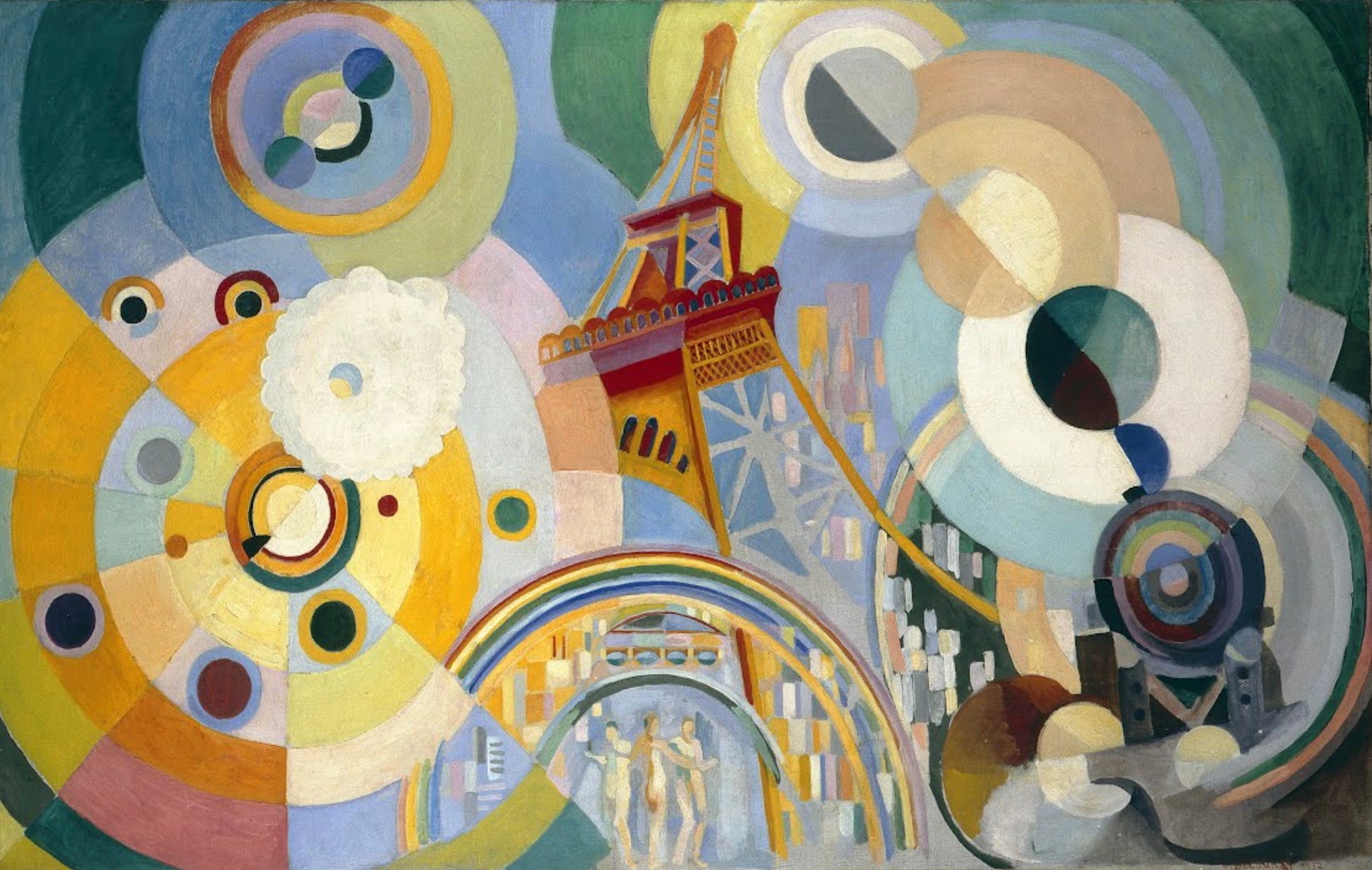
Robert Delaunay’s fascination with modern inventions never faded from his work, as we can see from Air, Iron, and Water from 1937. The center of the composition is anchored by the Eiffel Tower ( an example of iron), under which are three nude women arranged in the grouping known as the Three Graces, a theme that dates back to Greek mythology where they represented charm, beauty, and fertility. In art, the Graces were depicted as standing female nudes with the center figure seem from behind while the two flanking figures turn slightly left and right. The composition survives in a fresco from Pompeii and has been used repeatedly by painters and sculptors from the Renaissance to the present. The Graces are framed by arches containing rectangles suggesting the buildings of a city with the topmost arch having the appearance of a rainbow. To the right a train, also representing iron, approaches with circles of steam rising from its smokestack. To the right, rings of color bring to mind Sonia Delaunay’s Electric Prisms. A cloud-like form suggests a literal image of air and water; the dominant blue and green palette might also refer to water. This large work was clearly intended by the artist as major restatement of the artistic interests that had absorbed him for over 20 years.

At first glance, Cosmic Synchromy by American painter Morgan Russell (1886-1953) looks very similar to the Orphist paintings we’ve been examining. However, Russell and fellow American Stanton Macdonald-Wright (1890-1973) developed their ideas independently and called their style Synchromy. The two groups of artists, who encountered one another in Paris, both insisted that the other was completely unlike their movement. This painting is included in the Guggenheim’s Orphism show, which would probably have annoyed the artists in both movements. However, like the Orphists, Russell and Macdonald-Wright were interested in creating paintings in which color was orchestrated as a composer arranges music. The name Synchromy meaning “with color” was coined to parallel the word symphony (“with sound”). The arching forms in Cosmic Synchromy echo one another, here larger, there smaller, in the way that musical motifs repeat louder and quieter throughout a symphony. “Cosmic” in the title and the way that the arching forms appear from nothingness suggest that this visual harmony is inherent in the universe.

Kupka would certainly agree that harmonious visual compositions are a manifestation of a universal harmony, as it was an idea essential to Theosophy. In Cosmic Spring, we are looking at the end point of a series of studies exploring the individual elements of the composition. The center of this work appears as a distant group of parallel, pale blue arcs which surrounded by other sections comprised of bubbly patterns in various colors, some in contrasting colors, others in harmonious pairs. These energetic passages appear to explode around the peaceful core. These colors and patterns might have their origin in the artist’s observations of nature, his study of color theory, or his religious beliefs, or some mix of these, but they fulfill an important goal of Orphism – to capture the essence of interrelated states of being through the transformative power of luminous color.
Orphism was one of many competing artistic ideas which are placed under the heading “School of Paris,” a category which encompasses the astonishing diversity of modernist art in Paris in the first half of the 20th century. I’ve always thought the artists discussed in this edition are surprisingly little known. Perhaps you’ll be inspired to seek out their works now that you’ve seen some of what they achieved. As always, thanks for reading and subscribing. Look for a new post next week.
Harmony and Dissonance: Orphism in Paris, 1910-1930
Solomon R. Guggenheim Museum, New York City, through Mar 9, 2025 https://www.guggenheim.org/exhibition/harmony-and-dissonance-orphism-in-paris-1910-1930


