Chance Encounters, Edition 68
Jasper Johns: Things Known And Unknown
All familiar things can open into strange worlds. – Jasper Johns
American artist Jasper Johns (b. 1930) is best known for his early works depicting easily recognized objects, like flags, targets, and maps. In his 70 year career, the artist has returned to those early motifs many times, while also exploring new ideas, images, and patterns. For 70 years, Johns has been creatin drawings, paintings, prints and sculptures, using nearly every medium and technique available in each discipline. I’ve chosen small group of works that I hope will suggest the variety and continuity in Johns’ body of work.
Early in his life, Johns decided that someday he would be an artist. Growing up in South Carolina, shuttled among various relatives, he had little experience of art beyond his own drawings and some landscapes painted by his grandfather’s first wife. For a while, he studied art at the University of South Carolina where his teachers encouraged him to relocate to New York. His progress was interrupted by being drafted during the Korean War, but after serving in South Carolina and Japan, he returned to New York to take up his goal again.
Sometime during the mid-50s I said, 'I am an artist.' Before that, for many years, I had said, 'I'm going to be an artist.' Then I went through a change of mind and a change of heart. What made 'going to be an artist' into 'being an artist', was, in part, a spiritual change. – Jasper Johns
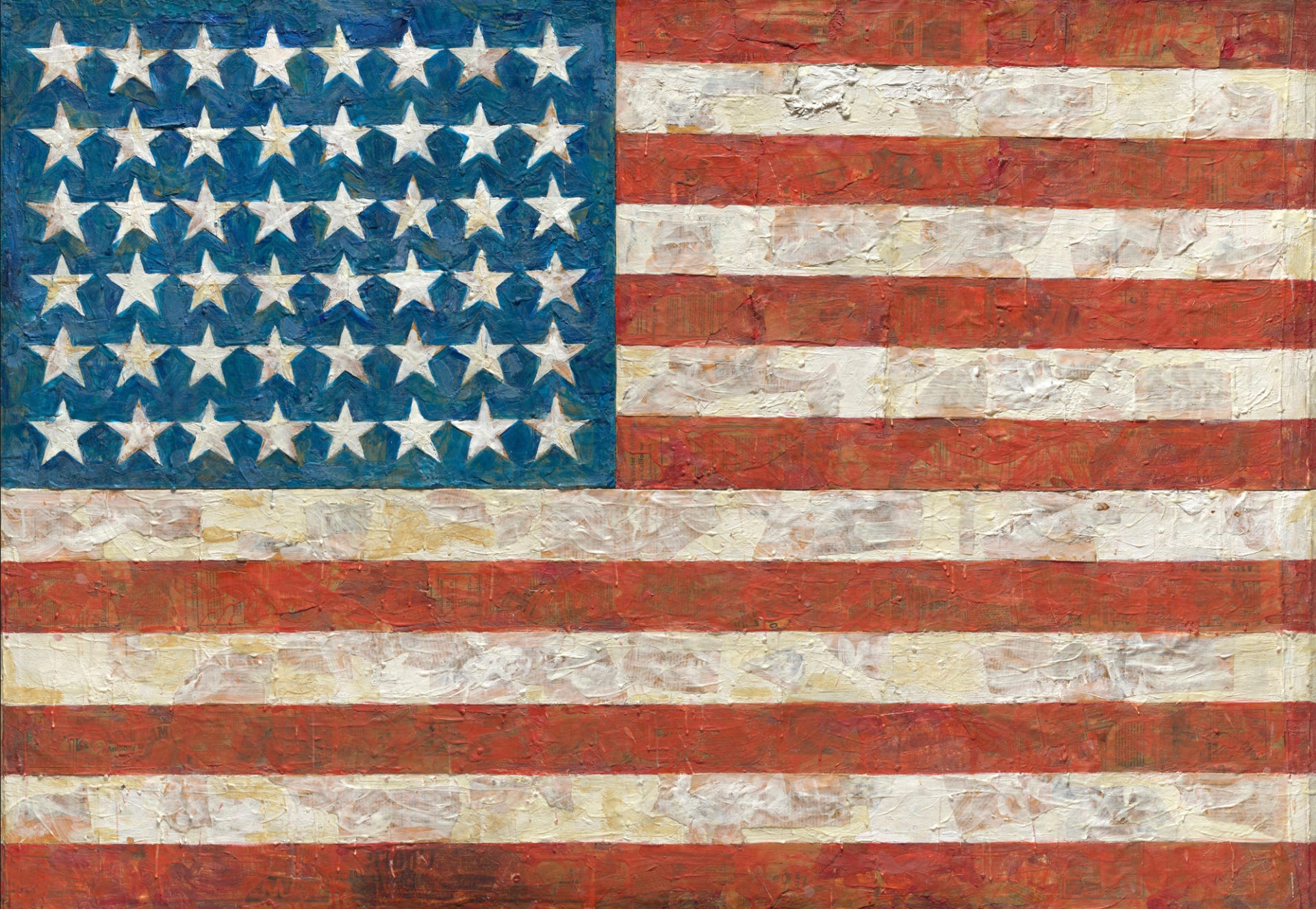
In 1954, Johns destroyed all of the work he had created up to that point and started on a new path. This was when he began to create works based on what he called “things already known.” The flat, familiar shapes of targets and flags are eye-catching, but they are so familiar that we usually see them without really considering them. These are the precise reason Johns chose his motifs. In reproduction, the artist’s works often appear as flat surfaces; in reality, the surfaces are textured and complex. In Flag, 1954-1955, bits of the collaged newspaper below the paint are visible, especially in the red stripes. Advertisements, comic strips, and text can be discerned. In the blue field, the paint is opaque but each star was applied as a separate paper shape and then painted so that each is unique. Works like this reward the viewer who takes the time to look and consider the possible meanings of both the symbolic subject and the layered materials.
Flags have been one of the artist’s favorite subjects, depicted in at least 27 paintings, 10 sculptures, 50 drawings and 18 print editions. Flag, the first in the series, was exhibited in Johns’ first solo gallery exhibition. Famed gallery owner Leo Castelli saw the artist’s works in 1957 and immediately offered to show them. The exhibition was very successful and Johns’ career took off from there.
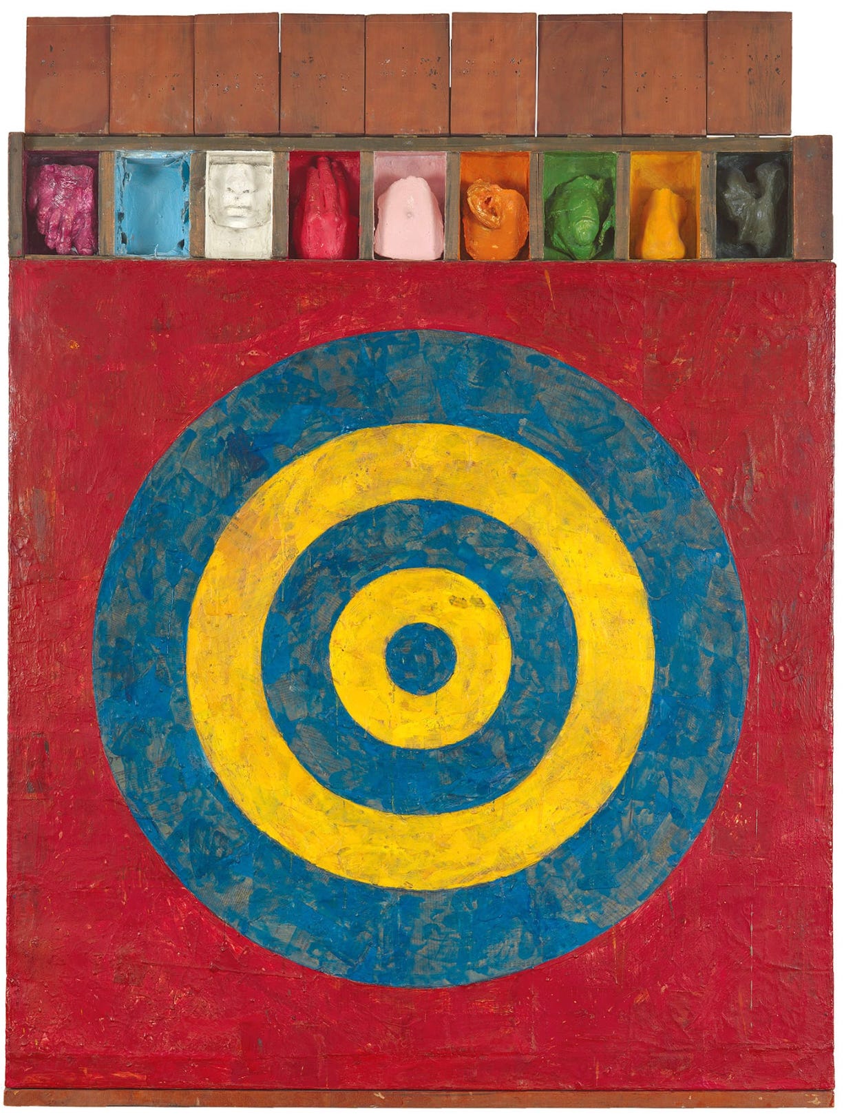
Target with Plaster Casts of 1955 demonstrates some of the characteristic elements of Johns’ work. The bold blue and yellow target on its red background is almost impossible to ignore. Even in reproduction, one can see that the paint is thinner in some places. Collaged elements beneath the paint is partially visible in some areas because the artist used a type of paint called encaustic. An ancient painting material, encaustic consists of pigment suspended in wax. Johns mastered this difficult and little-used method because the solidifying wax preserved textured brush marks and because, when applied thinly, encaustic is translucent, allowing a peek at the collage below.
The row of boxes above the target draw attention next, since they are rectangular elements in contrast to the circular target. Each box contains a plaster cast made from a body part (though there is no object in the light blue space); each is painted a different color. The artist said that he finds “broken” representations of the body, as in the boxes here, disconcerting. Throughout his career, Johns has incorporated fragments of bodies in his work, often as a way of exploring his own response to these details. This work poses a series of puzzles for the viewer; as soon as one feels they understand what they see, Johns adds something that can’t doesn’t seem to fit. He doesn’t explain the meaning, leaving the viewer to make sense of what they see.
I feel that works of art are an opportunity for people to construct meaning, so I don’t usually tell what they mean. It conveys to people that they have to participate. – Jasper Johns
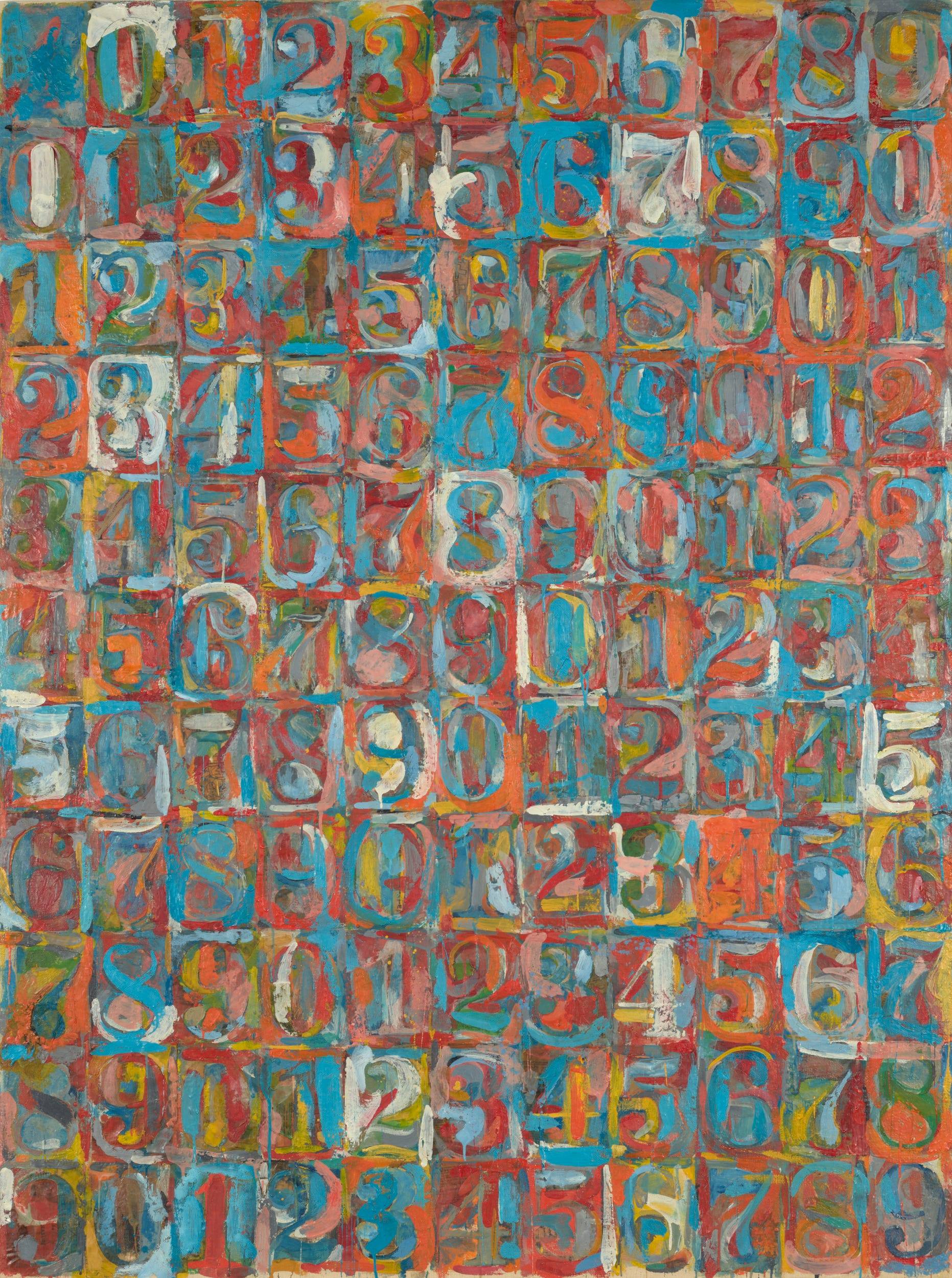
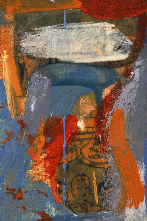
Repetitive images of numbers and letters are other recurring themes in Johns’ career. Using stencils for these works allowed the artist to achieve a patterned image quickly, so he could get to the presumably more interesting stage of applying color and texture. Numbers in Color, 1958-1959, consists of eleven rows and eleven columns of stenciled numerals, zero to nine. Each row continues from the end of the previous one, so each starts with a different number. Four colors (blue, orange, red, and yellow) are applied apparently randomly, sometimes obscuring parts of numbers, sometimes revealing the collaged newspaper below, as in the detail on “7” reproduced below where a bit of a comic strip can be seen.
Johns is often discussed as part of the rejection of a core practice of Abstract Expressionism (see Chance Encounters 23), self-expression meant to reveal the individual’s psychology or personality. John’s use of stencils and carefully outlined iconic forms shows his preference for controlled use of media and techniques and the artist’s thick encaustic stresses the paintings as a physical object rather than as a record of a psychological moment.
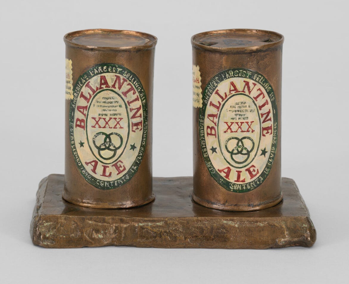
Johns created his first sculpture in 1958. For his earliest objects, he used a material called ScupMetal, a pliable, clay-like material that dried to a metallic finish and allowed him to shape mundane objects easily. Eventually he began creating plaster objects intending to cast them in bronze. Sometimes simply titled Painted Bronze, the completes sculptures are extremely realistic, as can be seen in this sculpture of two Ballantine Ale cans, one open and one not. The life-like painted labels remind one that Johns was often associated with the Pop Art movement when his works first attracted attention. Though Johns is often described as detached or purely intellectual, many of his methods and statements suggest that he was more interested in “intuitive responses to life and art,” to borrow writer and critic John Yau’s phrase. Yau, who has written frequently about Johns, suggests that the artist has been trying to merge objectivity and deep emotion throughout his career. At most, Johns can be considered Pop-adjacent. His work has also been discussed in the context of Neo-Dada, especially in the relation to Marcel Duchamp’s use of readymades. Though Johns does sometimes apply found objects to his works (see Bushbaby below), the majority of his works interpret familiar objects through the artist’s mind and hands in ways that are very different from Duchamp’s usual practice. In fact, Johns belongs to no group or movement. He struck out on a path of his own at the start of his career and followed were his inspiration led.
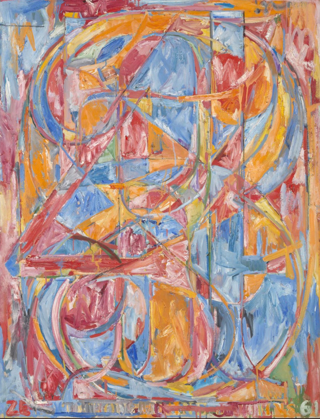
As with flags, Johns returned frequently to stenciled numbers in various arrangements. These often evolved through extensive experimentation in drawings and prints (see the gallery below). 0 through 9 from 1961, is part of a series in which the numerals are arranged on top of each other. This composition originated in a drawing, as arranging the numbers so that they retain some legibility was challenging. Eventually the artist created five large paintings like this one, as well as smaller paintings, a metal relief, and several prints. If you take the time, each number can be identified, but as with some optical illusions and Magic Eye pictures, you have to shift your focus to identify the different layers. The title is stenciled across the bottom of the painting, a practice the artist has used in many works. Like the numbers above them, the letters if the title seem to swim between layers of paint, forcing the viewer to focus intently to decipher the words. Once again, Johns asks the viewer to participate in creating meaning in the work.
It’s simple, you just take something and do something to it, and then do something else to it. Keep doing this, and pretty soon you’ve got something. – Jasper Johns
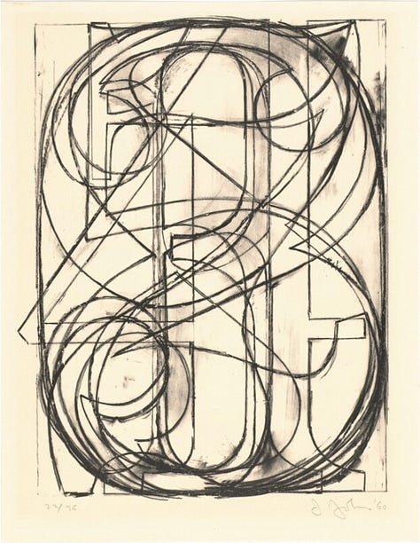
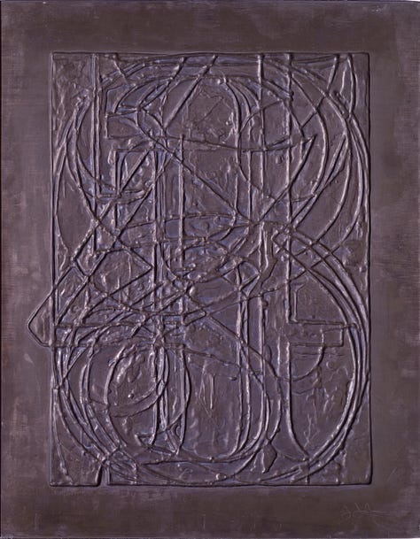
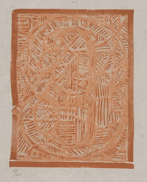
In this gallery, I have included 2 lithographic versions of this composition and the lead relief version ranging in date from 1960 to 1977. Repetition is a regular strategy in Johns’ career, as is constant experimentation in media and techniques. Though his practice is hardly as simple as his statement above implies, the artist really does take an idea, does something to it and keeps on doing things until he reaches a point of satisfaction. Johns has spoken of experiments that he felt failed and works he set aside because of this, but he has also reused old experiments in more successful later efforts.
Each creative stage informs the next, which in turn reevaluates what came before. With Johns, even as you plumb the implications of a particular motif or detail, it’s always the long view that matters. -- Thomas Micchelli, Hyperallergic, November 12, 2016
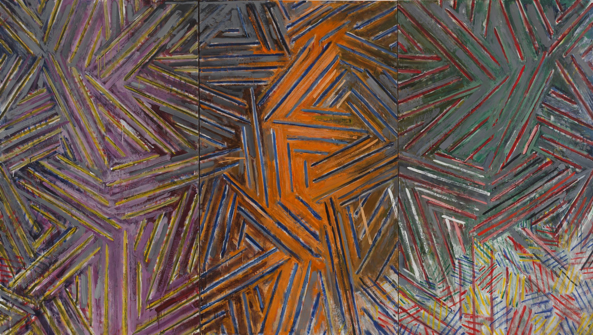
An exhibition of the artist’s work opened in mid-January at Gagosian in New York (see below for details). The show commemorates the first exhibition of Johns’ crosshatch paintings 50 years ago at the Castelli Gallery in New York. The exhibition contains loans from major American museums as well as works from the artist’s and other private collections. This series consists of compositions of interlocking parallel lines which appear in a wide variety of sizes and color combinations. Between the Clock and the Bed, 1981, a colorful composition in encaustic across three joined canvases, is included in the current Gagosian exhibition. The title refers to a late painting by the great Norwegian painter Edvard Munch (1863-1944), Self-Portrait Between the Clock and the Bed. The patterns of parallel lines across the whole painting are reminiscent of the bedspread on the right side of Munch’s self-portrait, but more specifically in the pale lower right corner of Johns’ painting with its prominent red and blue parallel lines. The composition of Johns’ work also has other echoes of Munch’s painting. The orange area in the center of Johns’ painting reminds one of the yellow and orange area behind the elderly figure of Munch. On the left panel of Johns’ painting, the purple section may be meant to echo either the figure or the clock in the older work. Though more abstract than Munch’s painting, the interlocking sections of parallel lines in Johns’ work produce a similar feeling of suspended time that the earlier artist created.
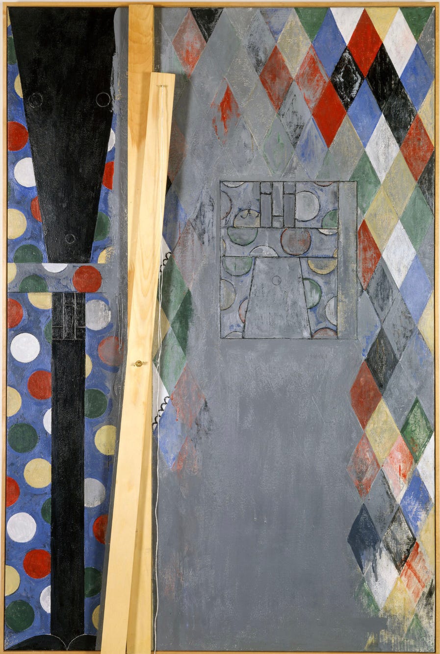
In the early 21st century, Johns continued to explore the power of pattern and shape. Bushbaby, 2003, contrasts a multicolored diamond pattern at the right with brightly colored polka dots at the left. These dots are overlaid with a black shape that is painted to look as if it passes under a section of canvas. This illusion is reinforced by the attachment of a pair of wooden slats and a string attached to the canvas with metal fittings. In the gray section where the diamond pattern fades away is a drawn section, a sketch of part of the left portion of the composition shown upside down, so that the work seems to represent its own creation. It is clear that the slats could move, that the string could be rearranged – that the appearance is as ambiguous and variable as the meaning is in so many of the artist’s works.
It's important that one sees the instability of what one is looking at—that it could be changed. I like that you're aware of other possibilities, whether you set them into motion or not. – Jasper Johns
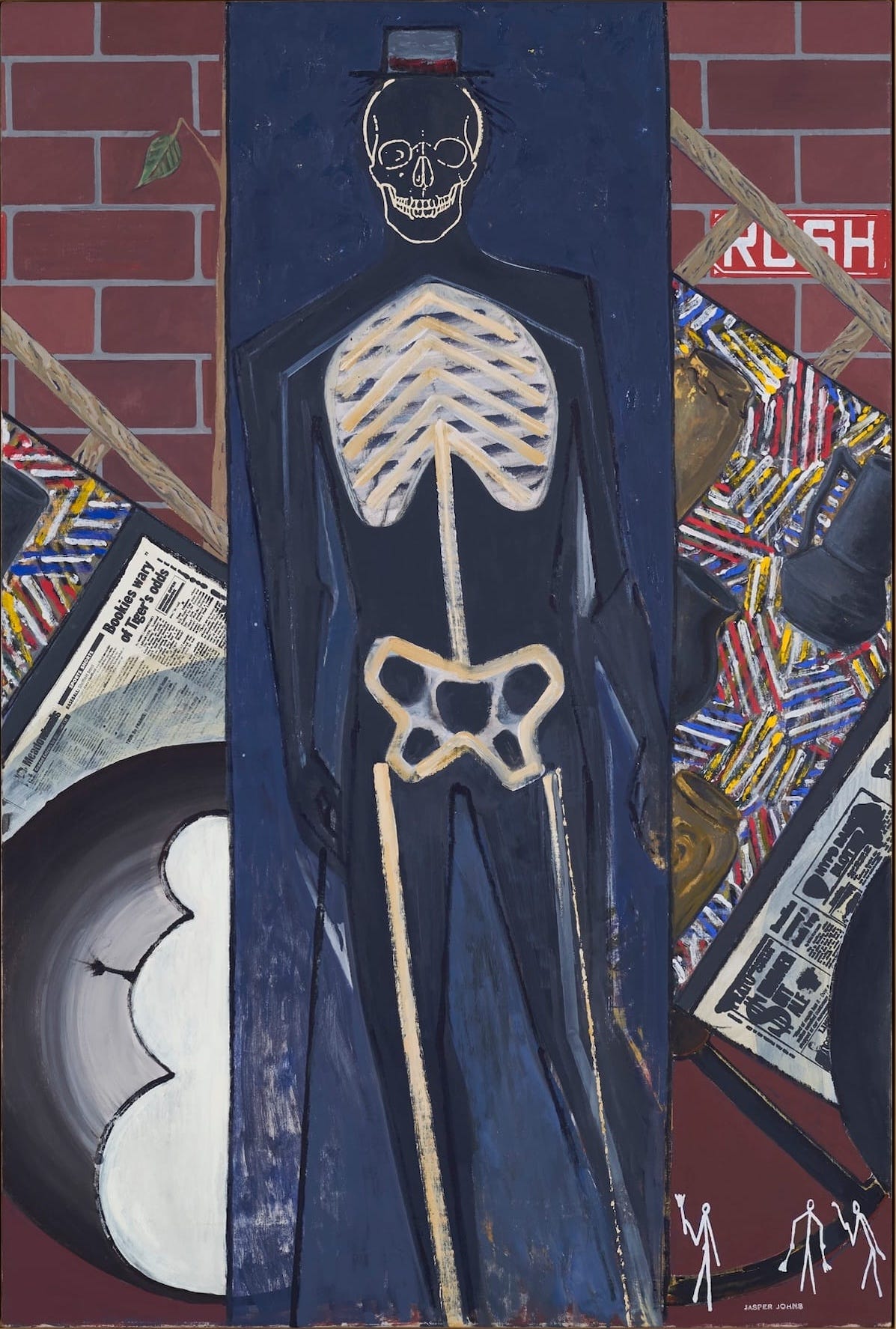
The most recent work in this survey is this untitled painting from a group is skeleton images. Leaning against a brick wall is a collection of ladders, canvases from the crosshatch series, some mounted newspapers, a snowman shape, and picture frames. These suggest a storage room where the artist’s belongings have been stored haphazardly. In the center is a blue box-like shape occupied by a human figure, partly solid and partly skeletal. It wears a jaunty hat and stands as if stepping toward the viewer. The figure is humorous yet eerie and looks back to the fragmentary bodies in some of the artist’s earlier works. A group of three stick figures in the lower right corner look even farther back into the past, which similar to prehistoric drawings. Painted when the artist was in his late 80s, this work and others in the series show Johns considering past, present, and future.
When something is new to us, we treat it as an experience. We feel that our senses are awake and clear. We are alive. – Jasper Johns
This brief survey hardly scratched the surface of Jasper John’s large and varied body of work. An artist concerned with the ambiguity of symbols, Johns repeatedly demonstrates that meaning is fluid and open to constant reinterpretation. He expects the viewer to participate in creating meaning in his creations which combine iconic symbols with the presence of the artist through visible marks of his hand.
Art is much less important than life, but what a poor life without it. – Jasper Johns
Exhibitions:
Jasper Johns: Between the Clock and the Bed, through March 14, at Gagosian, 980 Madison Avenue, New York, New York, USA. https://gagosian.com/exhibitions/2026/jasper-johns-between-the-clock-and-the-bed/
For Which It Stands… (an exhibition of art depicting the American flag including work by Jasper Johns), through July 25, at Fairfield University Art Museum, Fairfield, Connecticut, USA. https://www.fairfield.edu/museum/exhibitions/catalog/2026/for-which-it-stands/
Jasper Johns: a whole can be only a part, through October 31, at Powers Art Center, 13110 Highway 82, Carbondale, Colorado, USA. https://www.powersartcenter.org/awholecanbeonlyapart
Jasper Johns, opening February 12, at Glenstone, 12100 Glen Road, Potomac, Maryland, USA. https://www.glenstone.org/exhibitions/jasper-johns
Jasper Johns: Night Driver, May 29 – October 12, at Guggenheim Bilbao, Avenida Abandoibarra, 2, Bilbao, Spain. https://www.guggenheim-bilbao.eus/en/exhibitions/jasper-johns-night-driver
Thank you for subscribing, reading, sharing, and commenting on I Require Art’s Substack. I’ll be back with more art soon.


I love the Jasper Johns #3 painting