
Chance Encounters, Edition 70
An Artful Spring

I realized recently that I had written posts about three seasons, Summertime, Winter Inspires, and Autumn Harmonies. Since those of us in the Northern Hemisphere are about to experience the joys of Spring, it seems a good time to explore the coming season. I have chosen eight works inspired by Spring created by artists who were committed to following their own visions, often in the face of disapproval, misunderstanding, or even outright rejection. That independence is a core value of Modern and Contemporary Art, resulting in these beautiful and compelling paintings.
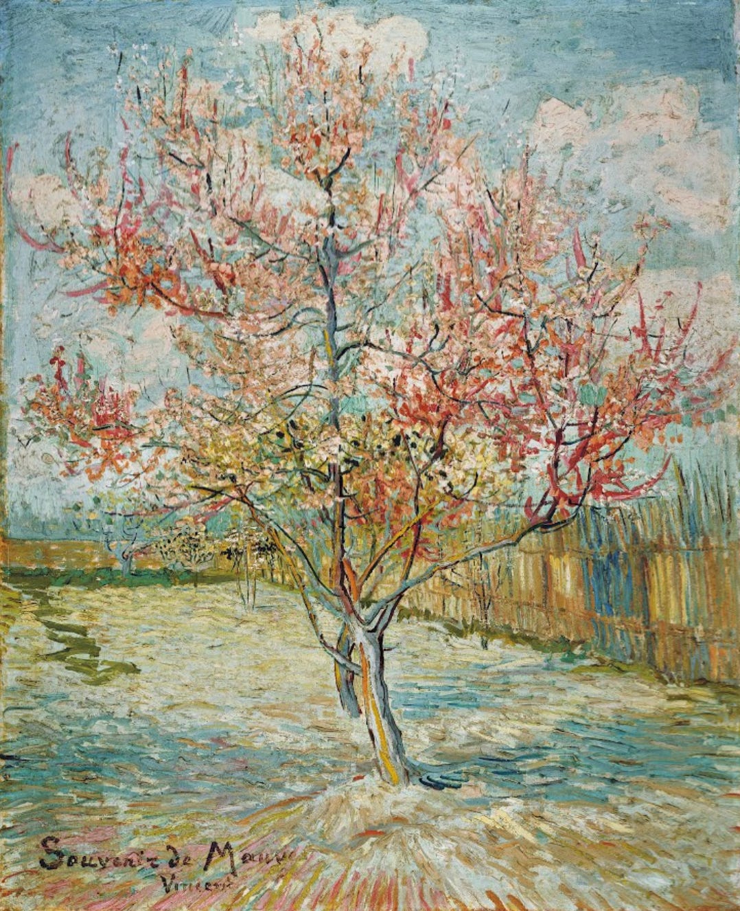
Pink Peach Trees (Souvenir de Mauve) by Vincent Van Gogh (Dutch, 1863-1890) appears fairly conventional because we have become accustomed to his dramatic personal style. In 1888, however, few appreciated the expressionist brushwork and increasingly vivid color the artist used. Painted in March 1888, about a month after Van Gogh had moved to Arles in Southern France, the artist was deeply inspired by the flowering fruit trees around his new hometown. Van Gogh produced 14 paintings and several drawings and sketches in a few weeks, painting blooming branches in vases of water, groups of trees in orchards, and single blooming trees. Van Gogh considered this painting one of the best of the series and it was nearing completion when he received a letter from his sister informing him of the death of his cousin by marriage, the Dutch artist Anton Mauve (Dutch, 1838-1888). Mauve, a central figure in The Hague School, taught Van Gogh how to use oil paint and watercolor. Touched by the loss and his affection for the older artist, Van Gogh wrote “Souvenir de Mauve” (“Memory of Mauve”) across the bottom of the painting and sent the work to Mauve’s widow Jet.
It seemed to me that in memory of Mauve we needed something that was both tender and very cheerful and not a study in a more serious key than that. – Vincent Van Gogh in a March 1888 letter to his brother Theo
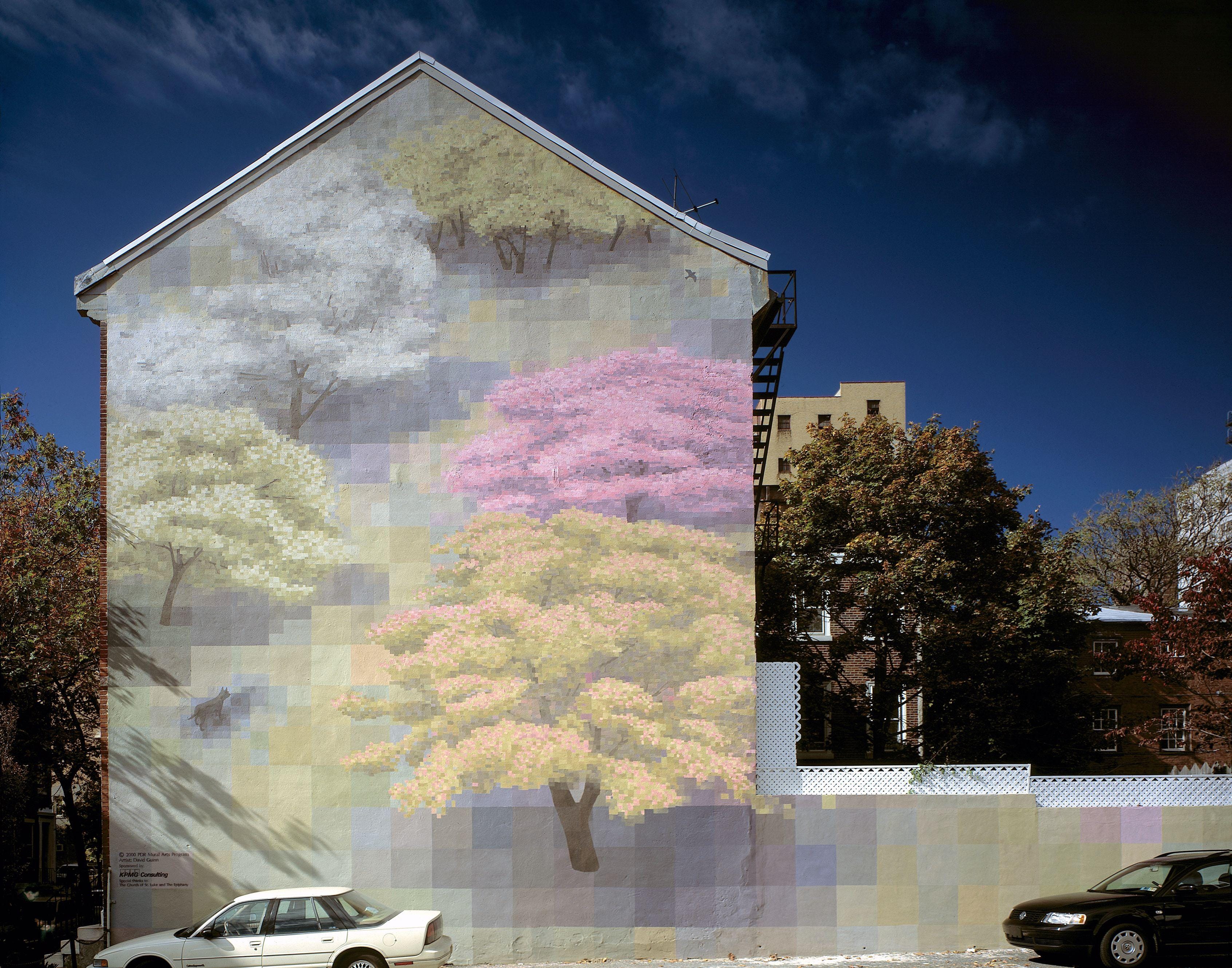
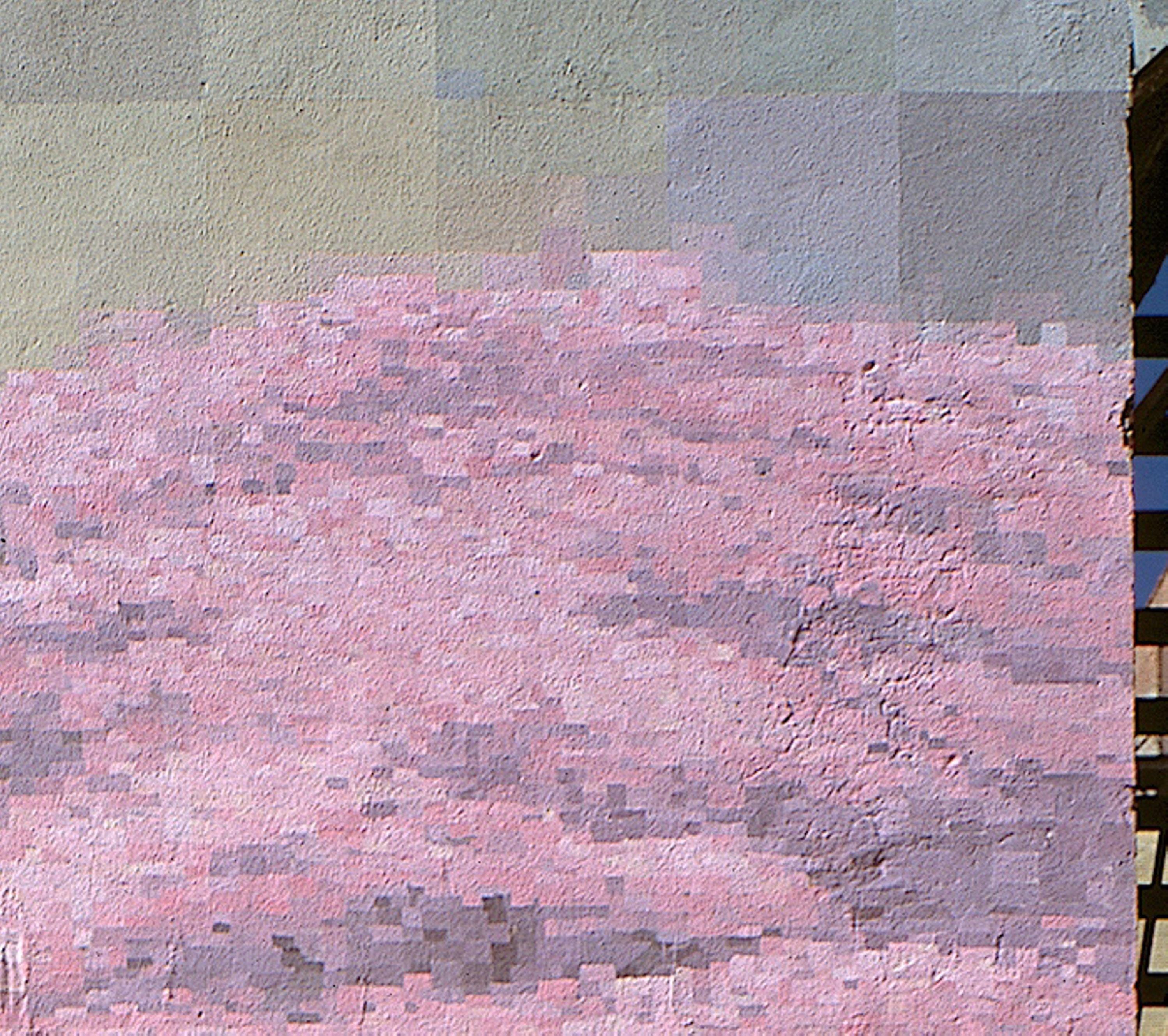
At first glance, the mural Spring by American artist David Guinn appears to be a more naturalistic scene of flowering trees than Van Gogh’s painting, but a closer look reveals that the composition is built from large and small squares. In the distant view above, the large squares are visible on the retaining wall and to the left of the pale green and peach colored tree. The detail view below reveals the small squares used in the trees themselves.
Based in Philadelphia, Guinn has painted over 40 murals in the city as well as in other American cities and even some overseas, including in Amman, Jordan and Montreal, Canada. The artist also created Freewall, an outdoor space in Philadelphia dedicated to promoting innovative mural art through temporary mural presentations. Though Guinn also creates and exhibits smaller works, the artist believes that public art builds and enhances community.
I like the impact: it’s so big. It’s powerful—you can’t deny it—when you see something that’s so much larger than the body. I like how it’s part of the world. People live with it. – David Guinn
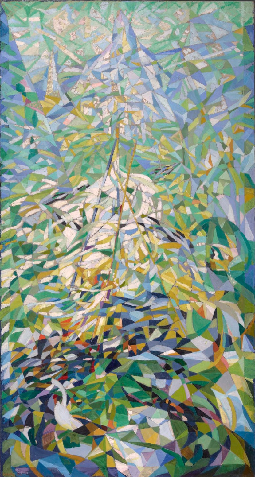
Though created over 80 years before Guinn’s mural, Spring (The Procession – A Chromatic Sensation) by Joseph Stella (Italian-American, 1877-1946) is far more abstract. This work displays the blend of Cubism, Futurism, and Fauvism that characterized Stella’s work in the 1910s and 1920s. Stella came to New York City in 1896 to study medicine. Quickly abandoning medicine for art, Stella studied at the Art Students League and New York School of Art. His early works were in a realist style and depicted immigrants and ethnic life in the city. Stella stayed in New York until 1909 when he returned to Italy due to homesickness. By 1911 he had relocated to Paris where he came in contact with many avant garde artists.
At my arrival, Fauvism, Cubism, and Futurism were in full swing. There was in the air the glamour of a battle, the holy battle raging for the assertion of a new truth. My youth plunged full in it. – Joseph Stella
Curious and open to new ideas, the artist quickly began to incorporate elements of the Parisian modernists. In 1913, with ambitions of making a splash, Stella returned to the United States. He was the first to bring the ideas of Futurism to the American art world. Futurism was a movement which combines Cubist fracturing of form with the illusion of motion. In this painting, a single figure in a white shirt emerges near the bottom of the composition, while a swirl of dark colors leading upward suggests the procession of the title. Long pole shapes appear to support white banners beneath a canopy of green and blue fragmented shapes, perhaps Spring leaves and sky above the parade.
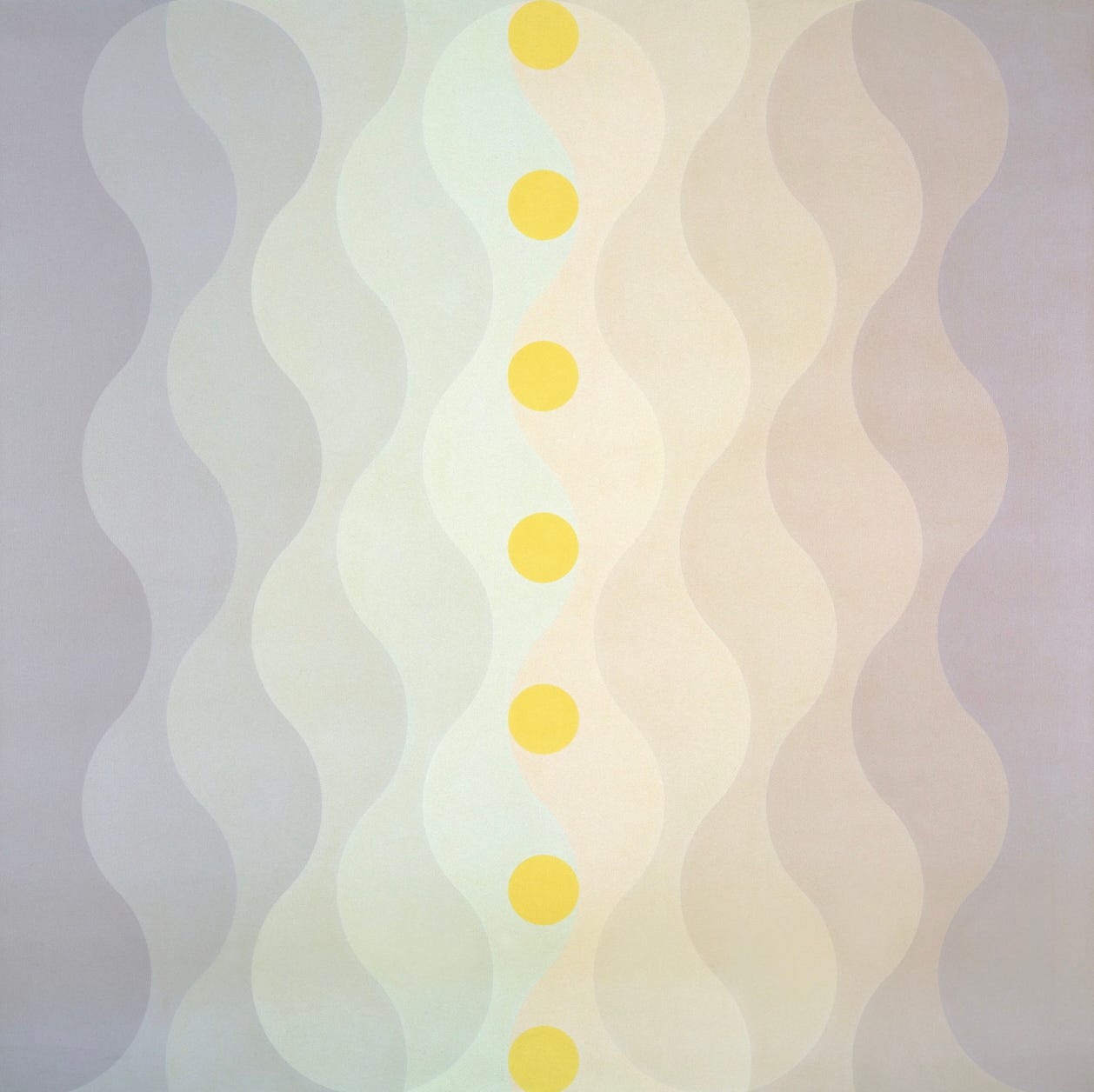
In this eight foot tall painting from her Veil series Edna Andrade (American, 1917-2008) carries our look at Spring-themed art into pure abstraction. Andrade, who, like David Guinn, was based in Philadelphia, was one of the early adopters of Op Art. Her earliest Op works have bright color, strong color contrasts, and dizzying patterns, but by the early 1970s when Spring Veils was painted, she was using more subtle color relationships and curving forms that create illusions of light and movement. Andrade studied at the University of Pennsylvania and the Pennsylvania Academy of Fine Arts. Travel grants permitted her to visit Germany after World War Two where she encountered the modernism of the Bauhaus. She was especially influenced by Paul Klee (Swiss-German, 1879-1940) and Josef Albers (below). The latter’s influence can be seen in Andrade’s carefully modulated color in Spring Veils. From the sunny yellow circles on the center axis, the colored bands to the left progress from yellow-green to gray-blue, while those to the right transition from pale orange to gray-violet. The whole palette suggests the soft colors of early Spring developing under the bright sun.
My work celebrates order and energy evident in nature. I take delight in measure and ratio, structure and system. … Our tradition reaches back through eons of time to that genius who first drew a circle and used its magic. I want to cultivate that magic so that those who contemplate my work may feel a serene energy and be heartened and refreshed. – Edna Andrade
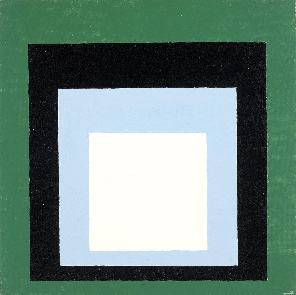
As mentioned above, an important influence on Andrade’s art was Josef Albers (German-American, 1888-1976). Considered one of the most influential art teachers of the 20th century United States, Albers came from a family of craftspeople and early in life learned skills like wiring, plumbing, and glass engraving. The artist became a student at the Bauhaus in 1920 and in just a couple of years was hired as a teacher. Albers’ background in craftsmanship appealed to Bauhaus leaders who taught that a firm understanding of both theory and practice were essential to an artist. In 1933 when the Bauhaus was closed under pressure from the rising power of the Nazis, Albers moved to the United States. Albers is best known for his Homage to the Square series of which Advancing Spring is a part. Comprised of hundreds of paintings and prints, these were rigorously planned and executed, depicting nested squares, often painted with a palette knife on Masonite, in three or four different colors. Advancing Spring is one of the smaller compositions in the series at 16 inches (40,6 centimeters) square; Albers made pieces as large as 4 feet (1.2 meter) square. The color combinations in Homage to the Square series create different effects of recession and advance depending on their arrangement. In Advancing Spring, to my eye, the bold black square appears closer than the green surrounding it. The pale blue appears to recede within the black while the bright white seems to advance, but different viewers react in different ways to color relationships. Albers published a book called Interaction of Color in 1963 in which he explained his color theories, including that our understanding of color is experiential. His theories were extremely influential in later 20th century art movements like Hard-edge Abstraction and, as with Andrade, on Op Art.
Every perception of color is an illusion. … we do not see colors as they really are. In our perception they alter one another. – Josef Albers
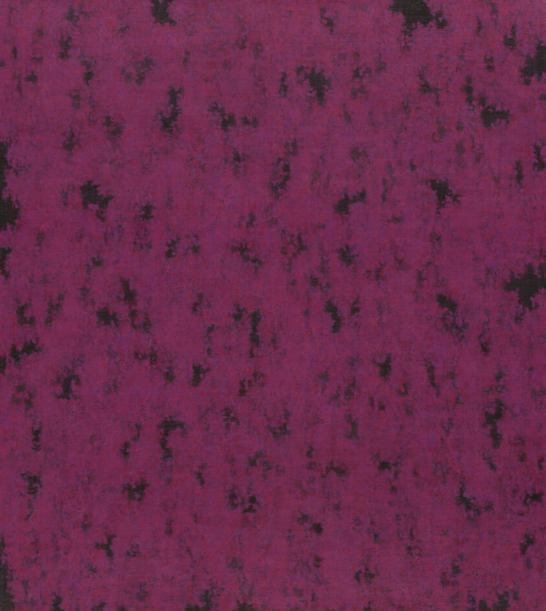
Compared to Albers’ extremely precise abstraction, the approach of Julia Fish (American, b. 1950) appears highly expressive. Bloom (1989) is a magenta, lavender, and deep green composition of oil paint and wax on canvas in layers which create an organic quality. The color combination seems to glow and even to move as you view it. It is almost like looking out through the fading light of twilight trying to see the details of a tree or flowering shrub. Fish was born and educated in Oregon, before studying at the Maryland Institute of Art. In her early years as an artist, she exhibited mostly in her home state though her reach began to grown after she began to teach at the University of Iowa. Relocating to Chicago in 1985 further expanded Fish’s audience; she exhibited in that city and then in New York in 1987. In the 1980s the artist’s work became increasingly abstract, but more recent works are more obviously based on architectural details than more organic works like Bloom. Fish works slowly, not responding immediately to seeing a potential subject. Instead she takes time to see the inspiration repeatedly so that the final work isn’t a momentary impression but a distillation of long experience of looking. The artist describes her work as durational rather than temporal.
It’s very unusual that I’ll see something, go to the studio, draw it and paint it. That rarely happens. I’ll see it and it will stay in my head for a while, and maybe later I’ll try to figure out through drawing what I saw. … That’s part of the distilling, getting a sense of what’s literally there, what’s tangible and intangible, what’s abstract and some other kind of order. – Julia Fish
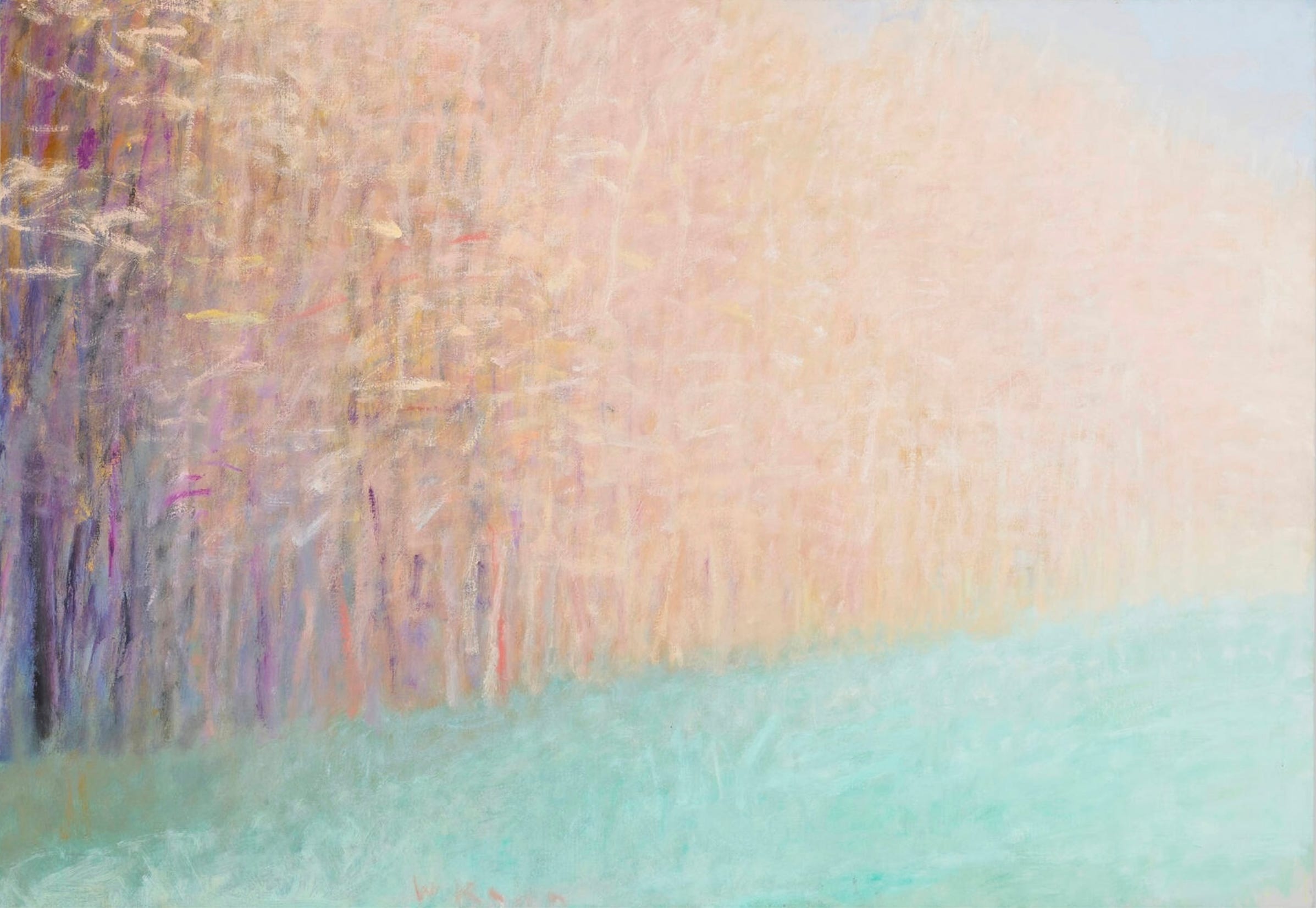
Painter and printmaker Wolf Kahn (German-American, 1927-2020) was the son of a prominent musician, composer, and conductor in Stuttgart. Because he was Jewish, Kahn’s father lost his job in 1933 as the Nazis came to power and forced Jews from public life. The artist’s family fled to the United States but because of immigration restrictions 3-year-old Wolf was left behind with his paternal grandmother. She encouraged his interest in art, even providing him with formal art lessons when he was 11. When Kahn was 13, the immigration quotas of the U.S had changed and he was able to join his family. In his late teens and early twenties, Kahn studied at the New School with Stuart Davis (American, 1892-1964), whose abstract style had been influenced by encounters with Cubism and with Hans Hofmann (German-American, 1880-1960), an important influence on and participant in the Abstract Expressionism movement. Throughout his career, Kahn focused on landscape as a subject but always sought to blend representation and painterly abstraction to create a highly personal and expressive image. Spring at the Edge of the Wood is clearly a depiction of the title subject but for this artist, painting was about more than representing what he saw.
People mistakenly think that art is about nature, or about an artist’s feelings about nature. It is instead a path of enlightenment and pleasure, one of many paths, where nature and the artist’s feelings are merely raw material. – Wolf Kahn
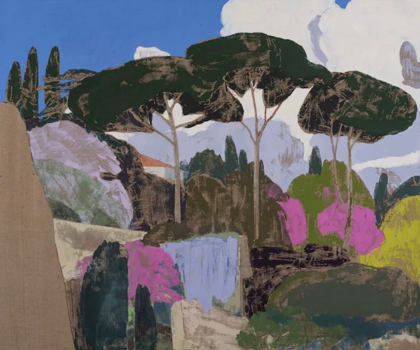
With this last work, by Eric Dever (America, b. 1962), we encounter another artist for whom nature is a starting point from which to build his art. The artist began exhibiting his work in the early 1990s but in 2002, having realized that his subject was actually the material properties of paint itself, Dever embarked on a decade-long research process . This began with working for 4 years exclusively in white paint before adding black for a couple of years. Red was next, and eventually he returned to using a full range of colors. At the same time, the artist was studying Hindu philosophy and practice which helped him formulate his new approach, attempting to capture the experience of nature rather than its surface appearance. Dever’s subjects are often limited to single flowers or other elements of his garden but the painting shared here, Via Sacra, Roman Spring, shows a wider view of a memorable sight in Italy. Painted just last year, this painting demonstrates Dever’s simplification of form as well as his adoption of some Surrealist techniques. The painting almost looks like a collage because of the clearly defined outlines of every shape. Areas of flat color, as in the sky, also create the sense of shapes cut from colored paper. In other parts of the composition, looking more closely reveals the use of two paint application techniques invented by the Surrealist Max Ernst (German, 1891-1976). Dever used grattage, in which a thickly painted canvas is pressed over a textured surface and then scraped to transfer the texture, and decalcomania, or pressing a sheet of some other material, like glass, paper, or foil, onto a wet paint-covered surface and then peeling it away to create textures in the paint. Most of the trees and forms show evidence of these methods. Like Fish, Dever believes that his experience of nature must be distilled through contemplation.
There are things you can see in reflection that you can’t see from direct observation. – Eric Dever
That’s the end of this collection of Spring-inspired paintings. Though they might not be the idyllic visions of the season one might expect, I hope some of the warmth and beauty of Spring spoke to you from these works.
… the winter is always a difficult, anxious and oppressive time, and spring is a deliverance. – Vincent Van Gogh
Current and upcoming exhibitions including these artists:
Josef Albers: Duets, ends March 21 at David Zwirner, 108, rue Vieille du Temple, Paris, France, https://www.davidzwirner.com/exhibitions/2026/josef-albers-duets
Josef Albers: Meditations, April 9, 2026-January 10, 2027 at Villa Panza, Piazza Litta, Varese, Italy, https://www.albersfoundation.org/exhibitions/josef-albers-meditations
Van Gogh’s Sunflowers: A Symphony in Blue and Yellow, June 6 to October 11, 2026 at Philadelphia Museum of Art, 2600 Benjamin Franklin Parkway, Philadelphia, Pennsylvania, USA, https://www.philamuseum.org/exhibitions/van-gogh-sunflowers
Thanks for subscribing. If you enjoyed this post, please like, share, and comment. I’ll be back soon with more art. Happy Spring!
Mr. Van Gogh did a MUCH better job of sharing Spring with us then most of the others did, especially passing off Green, black, light blue and white squares as "coming Spring" A couple of the others had colors that hinted at Spring, but not the line of eggs ready for frying.
I'm just glad I'm back on the list. I do enjoy you sharing art and comments with us.
Exquisite work of art!